Tailwind CSS Image
Our Tailwind CSS Image component simplifies image handling and styling, offering an array of classes to achieve the image effects that you are looking for in your website or application.
From adjusting image sizes to creating visually appealing galleries, Tailwind CSS empowers you to optimize and customize your web images with ease.
See below our examples of image UI components.
Tailwind CSS Image Examples:
Default Image
This example displays a simple image within a scrollable, centered grid layout. The responsive design classes ensure that the layout adapts to different screen sizes, enhancing the user experience across devices.
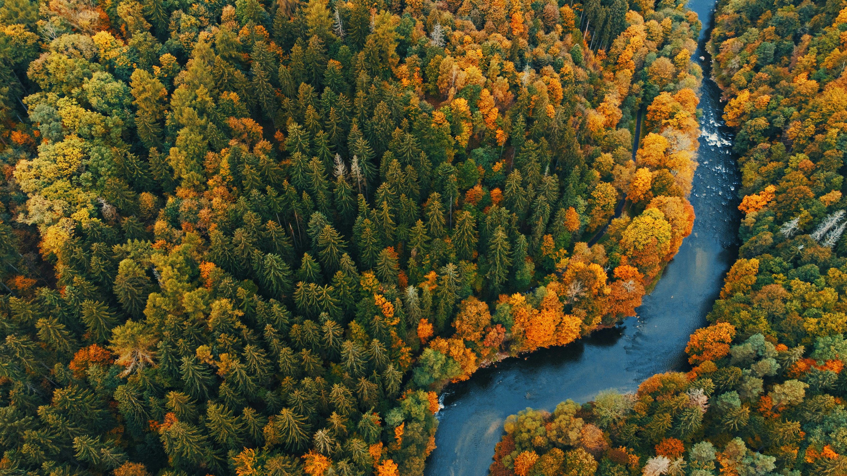
<div class="grid min-h-[140px] w-full place-items-center overflow-x-scroll rounded-lg p-6 lg:overflow-visible">
<img
class="object-cover object-center w-full h-96"
src="https://images.unsplash.com/photo-1682407186023-12c70a4a35e0?ixlib=rb-4.0.3&ixid=MnwxMjA3fDB8MHxwaG90by1wYWdlfHx8fGVufDB8fHx8&auto=format&fit=crop&w=2832&q=80"
alt="nature image"
/>
</div>Image With Rounded Corners
Check this example to see how you can implement rounded corners for your images.
<div class="grid min-h-[140px] w-full place-items-center overflow-x-scroll rounded-lg p-6 lg:overflow-visible">
<img
class="object-cover object-center w-full rounded-lg h-96"
src="https://images.unsplash.com/photo-1682407186023-12c70a4a35e0?ixlib=rb-4.0.3&ixid=MnwxMjA3fDB8MHxwaG90by1wYWdlfHx8fGVufDB8fHx8&auto=format&fit=crop&w=2832&q=80"
alt="nature image"
/>
</div>Circular Image
Use rounded-full class to round the corners of the image into a circle. This effect will be most noticeable if the image is square; otherwise, the image will look elliptical.
<div class="grid min-h-[140px] w-full place-items-center overflow-x-scroll rounded-lg p-6 lg:overflow-visible">
<img
class="object-cover object-center rounded-full h-96 w-96"
src="https://images.unsplash.com/photo-1682407186023-12c70a4a35e0?ixlib=rb-4.0.3&ixid=MnwxMjA3fDB8MHxwaG90by1wYWdlfHx8fGVufDB8fHx8&auto=format&fit=crop&w=2832&q=80"
alt="nature image"
/>
</div>Image with Caption
Use this example if you want to include a caption below the image. Adding images with captions enriches the content and provides visual breaks in the text.
<div class="grid min-h-[140px] w-full place-items-center overflow-x-scroll rounded-lg p-6 lg:overflow-visible">
<img
class="object-cover object-center w-full rounded-lg h-96"
src="https://images.unsplash.com/photo-1682407186023-12c70a4a35e0?ixlib=rb-4.0.3&ixid=MnwxMjA3fDB8MHxwaG90by1wYWdlfHx8fGVufDB8fHx8&auto=format&fit=crop&w=2832&q=80"
alt="nature image"
/>
<div class="block mt-2 font-sans text-sm antialiased font-normal leading-normal text-center text-inherit">
Image caption
</div>
</div>Image with Shadow
In this example, the shadow-xl shadow-blue-gray-900/50 classes add a large shadow effect with a specific color (blue-gray-900) and opacity (50%). This creates a sense of depth and improves the image visually from its background, making it stand out more prominently.
<div class="grid min-h-[140px] w-full place-items-center overflow-x-scroll rounded-lg p-6 lg:overflow-visible">
<img
class="object-cover object-center w-full rounded-lg shadow-xl h-96 shadow-blue-gray-900/50"
src="https://images.unsplash.com/photo-1682407186023-12c70a4a35e0?ixlib=rb-4.0.3&ixid=MnwxMjA3fDB8MHxwaG90by1wYWdlfHx8fGVufDB8fHx8&auto=format&fit=crop&w=2832&q=80"
alt="nature image"
/>
</div>Image with Blurred Caption
In the example below, the styling includes a semi-transparent white background with a blur effect (backdrop-blur-sm), making the text readable regardless of the image behind it. The border, padding, and shadow improve visibility and aesthetic appeal.
Sara Lamalo
20 July 2022
Growth
<div class="grid min-h-[140px] w-full place-items-center overflow-x-scroll rounded-lg p-6 lg:overflow-visible">
<figure class="relative w-full h-96">
<img class="object-cover object-center w-full h-full rounded-xl"
src="https://images.unsplash.com/photo-1682407186023-12c70a4a35e0?ixlib=rb-4.0.3&ixid=MnwxMjA3fDB8MHxwaG90by1wYWdlfHx8fGVufDB8fHx8&auto=format&fit=crop&w=2832&q=80"
alt="nature image" />
<figcaption className="absolute bottom-8 left-2/4 flex w-[calc(100%-4rem)] -translate-x-2/4 justify-between rounded-xl border border-white bg-white/75 py-4 px-6 shadow-lg shadow-black/5 saturate-200 backdrop-blur-sm">
<div>
<h5 className="text-xl font-medium text-slate-800">
Sara Lamalo
</h5>
<p className="mt-2 text-slate-600">
20 July 2022
</p>
</div>
<h5 className="text-xl font-medium text-slate-800">
Growth
</h5>
</figcaption>
</figure>
</div>Explore More Tailwind CSS Examples
Check out more image component examples from Material Tailwind Blocks: