Tailwind CSS Card
Use our cards to provide a flexible and extensible content container based on Tailwind CSS with multiple variants and options.
By its definition, a card is a sheet of material that serves as an entry point to more detailed information. Cards usually include a photo, text, and a link about a single subject. They should be easy to scan for relevant and actionable information. Elements, like text and images, should be placed on them in a way that clearly indicates hierarchy.
See below our beautiful Tailwind CSS card examples that you can use in your web and app projects.
Card Examples:
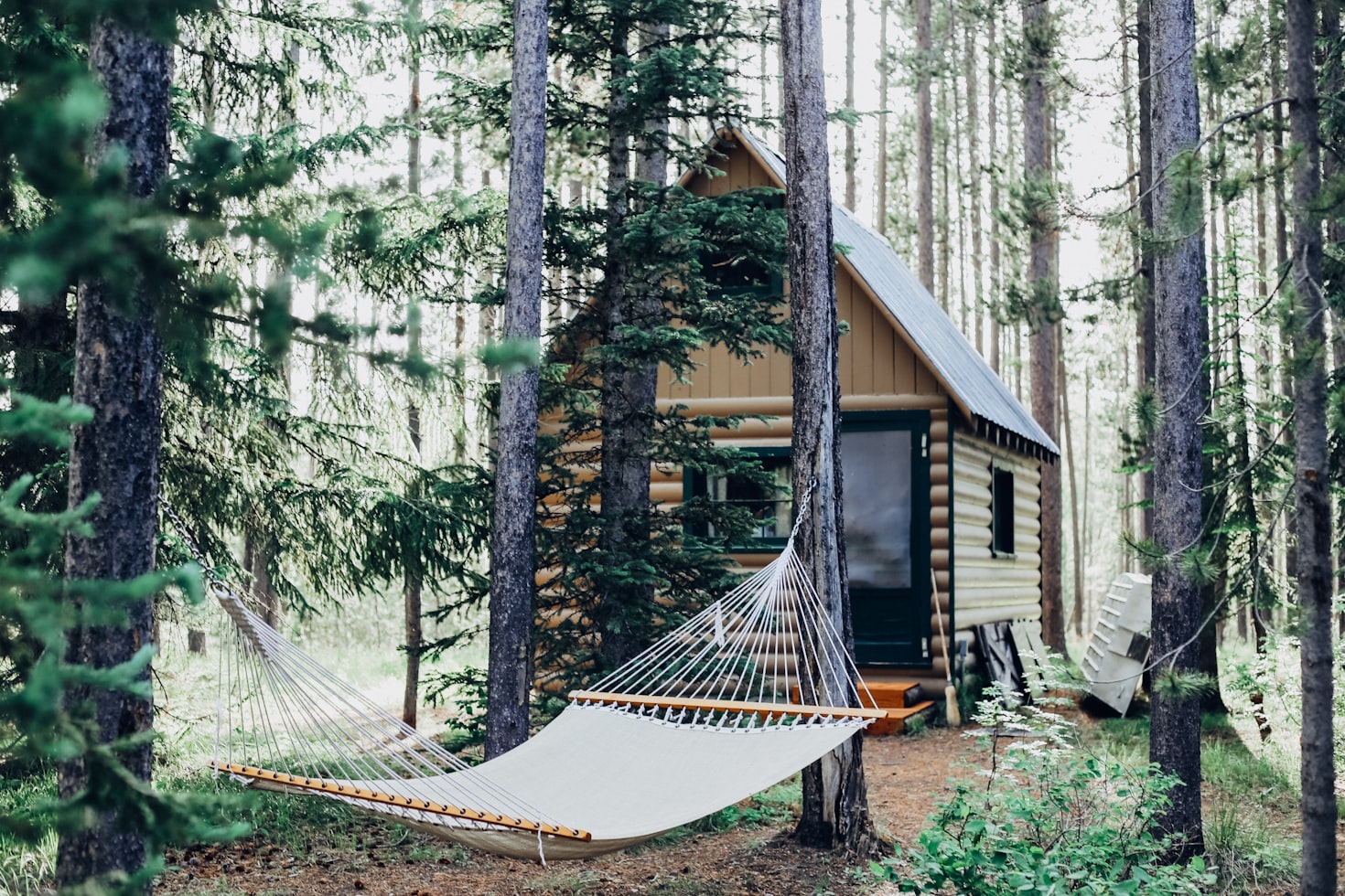
Default Card
This versatile card component example contains an image, title, text, and button, being suitable for a wide range of web design applications. The utility classes from Tailwind CSS ensure that the card is responsive and can adjust to different screen sizes.

Website Review Check
The place is close to Barceloneta Beach and bus stop just 2 min by walk and near to "Naviglio" where you can enjoy the main night life in Barcelona.
<div class="relative flex flex-col my-6 bg-white shadow-sm border border-slate-200 rounded-lg w-96">
<div class="relative h-56 m-2.5 overflow-hidden text-white rounded-md">
<img src="https://images.unsplash.com/photo-1540553016722-983e48a2cd10?ixlib=rb-1.2.1&ixid=MnwxMjA3fDB8MHxwaG90by1wYWdlfHx8fGVufDB8fHx8&auto=format&fit=crop&w=800&q=80" alt="card-image" />
</div>
<div class="p-4">
<h6 class="mb-2 text-slate-800 text-xl font-semibold">
Website Review Check
</h6>
<p class="text-slate-600 leading-normal font-light">
The place is close to Barceloneta Beach and bus stop just 2 min by walk
and near to "Naviglio" where you can enjoy the main night life in
Barcelona.
</p>
</div>
<div class="px-4 pb-4 pt-0 mt-2">
<button class="rounded-md bg-slate-800 py-2 px-4 border border-transparent text-center text-sm text-white transition-all shadow-md hover:shadow-lg focus:bg-slate-700 focus:shadow-none active:bg-slate-700 hover:bg-slate-700 active:shadow-none disabled:pointer-events-none disabled:opacity-50 disabled:shadow-none" type="button">
Read more
</button>
</div>
</div> Tailwind CSS Simple Card
Use this card example with clean design for article summaries, product/ service highlights, event descriptions, or user testimonials. It features a clear hierarchy of text, comfortable spacing, and a button for action.
Website Review Check Update from Our Team in San Francisco
The place is close to Barceloneta Beach and bus stop just 2 min by walk and near to Naviglio where you can enjoy the main night life in Barcelona.
<div class="relative flex flex-col my-6 bg-white shadow-sm border border-slate-200 rounded-lg w-96">
  <div class="p-4">
    <h5 class="mb-2 text-slate-800 text-xl font-semibold">
      Website Review Check Update from Our Team in San Francisco
    </h5>
    <p class="text-slate-600 leading-normal font-light">
      The place is close to Barceloneta Beach and bus stop just 2 min by walk and near to Naviglio where you can enjoy the main night life in Barcelona.
    </p>

    <button class="rounded-md bg-slate-800 py-2 px-4 mt-6 border border-transparent text-center text-sm text-white transition-all shadow-md hover:shadow-lg focus:bg-slate-700 focus:shadow-none active:bg-slate-700 hover:bg-slate-700 active:shadow-none disabled:pointer-events-none disabled:opacity-50 disabled:shadow-none" type="button">
      Read more
    </button>
  </div>
</div>
Tailwind CSS Card with Link
The design elements such as the SVG icon, text content, and interactive button, combined with the clean and modern styling provided by Tailwind CSS, make this card example versatile and adaptable to a wide range of uses.
Website Review Check
Because it's about motivating the doers. Because I'm here to follow my dreams and inspire others.
<div class="relative flex flex-col my-6 bg-white shadow-sm border border-slate-200 rounded-lg w-96 p-6">
<div class="flex items-center mb-4">
<svg xmlns="http://www.w3.org/2000/svg" fill="none" viewBox="0 0 24 24" stroke-width="1.5" stroke="currentColor" class="h-6 w-6 text-slate-600">
<path stroke-linecap="round" stroke-linejoin="round" d="M12 21a9.004 9.004 0 0 0 8.716-6.747M12 21a9.004 9.004 0 0 1-8.716-6.747M12 21c2.485 0 4.5-4.03 4.5-9S14.485 3 12 3m0 18c-2.485 0-4.5-4.03-4.5-9S9.515 3 12 3m0 0a8.997 8.997 0 0 1 7.843 4.582M12 3a8.997 8.997 0 0 0-7.843 4.582m15.686 0A11.953 11.953 0 0 1 12 10.5c-2.998 0-5.74-1.1-7.843-2.918m15.686 0A8.959 8.959 0 0 1 21 12c0 .778-.099 1.533-.284 2.253m0 0A17.919 17.919 0 0 1 12 16.5c-3.162 0-6.133-.815-8.716-2.247m0 0A9.015 9.015 0 0 1 3 12c0-1.605.42-3.113 1.157-4.418" />
</svg>
<h5 class="ml-3 text-slate-800 text-xl font-semibold">
Website Review Check
</h5>
</div>
<p class="block text-slate-600 leading-normal font-light mb-4">
Because it's about motivating the doers. Because I'm here to follow my dreams and inspire others.
</p>
<div>
<a href="#" class="text-slate-800 font-semibold text-sm hover:underline flex items-center">
Learn More
<svg xmlns="http://www.w3.org/2000/svg" class="ml-2 h-4 w-4" fill="none" viewBox="0 0 24 24" stroke="currentColor">
<path stroke-linecap="round" stroke-linejoin="round" stroke-width="2" d="M14 5l7 7m0 0l-7 7m7-7H3" />
</svg>
</a>
</div>
</div>Card with Header
You can always add additional information to a regular card. Usually these are secondary details about the main topic of the card.
Website Review Check Update from Our Team in San Francisco
The place is close to Barceloneta Beach and bus stop just 2 min by walk and near to Naviglio where you can enjoy the main night life in Barcelona.
<div class="relative flex flex-col my-6 bg-white shadow-sm border border-slate-200 rounded-lg w-96">
  <div class="mx-3 mb-0 border-b border-slate-200 pt-3 pb-2 px-1">
    <span class="text-sm text-slate-600 font-medium">
      Header for the card
    </span>
  </div>

  <div class="p-4">
    <h5 class="mb-2 text-slate-800 text-xl font-semibold">
      Website Review Check Update from Our Team in San Francisco
    </h5>
    <p class="text-slate-600 leading-normal font-light">
      The place is close to Barceloneta Beach and bus stop just 2 min by walk and near to Naviglio where you can enjoy the main night life in Barcelona.
    </p>
  </div>
</div>
Card with Footer
At the end of the card, add additional information that are as a secondary source of information.
Card with Header & Footer
This card example features a structured layout with a defined header, body, and footer section, perfect for organizing content clearly. The header usually contains the card title, icons, or action buttons, whereas the footer can include call-to-action buttons, additional links, or additional information.
Tailwind CSS Profile Card
This card example is ideal for introducing individuals, such as team members, employees, or speakers at an event, on a company website, event page, or within an app.

Natalie Paisley
Product Manager
The place is close to Barceloneta Beach and bus stop just 2 min by walk and near to Naviglio where you can enjoy the main night life in Barcelona.
<div class="flex flex-col bg-white shadow-sm border border-slate-200 rounded-lg my-6 w-96">
  <div class="m-2.5 overflow-hidden rounded-md h-80 flex justify-center items-center">
    <img class="w-full h-full object-cover" src="https://docs.material-tailwind.com/img/team-3.jpg" alt="profile-picture" />
  </div>
  <div class="p-6 text-center">
    <h4 class="mb-1 text-xl font-semibold text-slate-800">
      Natalie Paisley
    </h4>
    <p
      class="text-sm font-semibold text-slate-500 uppercase">
      Product Manager
    </p>
    <p class="text-base text-slate-600 mt-4 font-light ">
        The place is close to Barceloneta Beach and bus stop just 2 min by walk and near to Naviglio where you can enjoy the main night life in Barcelona.
    </p>
  </div>
  <div class="flex justify-center p-6 pt-2 gap-7">
    <button class="min-w-32  rounded-md bg-slate-800 py-2 px-4 border border-transparent text-center text-sm text-white transition-all shadow-md hover:shadow-lg focus:bg-slate-700 focus:shadow-none active:bg-slate-700 hover:bg-slate-700 active:shadow-none disabled:pointer-events-none disabled:opacity-50 disabled:shadow-none" type="button">
      Follow
    </button>
  </div>
</div>
The design of this card features rounded-xl corners, shadow for depth, and gradient text for the role description.
Tailwind CSS Login Card
Use this card example for building login pages where users need to enter their credentials (email and password) to access their accounts.
<div class="relative flex flex-col bg-white shadow-sm border border-slate-200 w-96 rounded-lg my-6">
<div class="relative m-2.5 items-center flex justify-center text-white h-24 rounded-md bg-slate-800">
<h3 class="text-2xl">
Sign In
</h3>
</div>
<div class="flex flex-col gap-4 p-6">
<div class="w-full max-w-sm min-w-[200px]">
<label class="block mb-2 text-sm text-slate-600">
Email
</label>
<input type="email" class="w-full bg-transparent placeholder:text-slate-400 text-slate-700 text-sm border border-slate-200 rounded-md px-3 py-2 transition duration-300 ease focus:outline-none focus:border-slate-400 hover:border-slate-300 shadow-sm focus:shadow" placeholder="Your Email" />
</div>
<div class="w-full max-w-sm min-w-[200px]">
<label class="block mb-2 text-sm text-slate-600">
Password
</label>
<input type="password" class="w-full bg-transparent placeholder:text-slate-400 text-slate-700 text-sm border border-slate-200 rounded-md px-3 py-2 transition duration-300 ease focus:outline-none focus:border-slate-400 hover:border-slate-300 shadow-sm focus:shadow" placeholder="Your Password" />
</div>
<div class="inline-flex items-center mt-2">
<label class="flex items-center cursor-pointer relative" for="check-2">
<input type="checkbox" class="peer h-5 w-5 cursor-pointer transition-all appearance-none rounded shadow hover:shadow-md border border-slate-300 checked:bg-slate-800 checked:border-slate-800" id="check-2" />
<span class="absolute text-white opacity-0 pointer-events-none peer-checked:opacity-100 top-1/2 left-1/2 transform -translate-x-1/2 -translate-y-1/2">
<svg xmlns="http://www.w3.org/2000/svg" class="h-3.5 w-3.5" viewBox="0 0 20 20" fill="currentColor" stroke="currentColor" stroke-width="1">
<path fill-rule="evenodd" d="M16.707 5.293a1 1 0 010 1.414l-8 8a1 1 0 01-1.414 0l-4-4a1 1 0 011.414-1.414L8 12.586l7.293-7.293a1 1 0 011.414 0z" clip-rule="evenodd"></path>
</svg>
</span>
</label>
<label class="cursor-pointer ml-2 text-slate-600 text-sm" for="check-2">
Remember Me
</label>
</div>
</div>
<div class="p-6 pt-0">
<button class="w-full rounded-md bg-slate-800 py-2 px-4 border border-transparent text-center text-sm text-white transition-all shadow-md hover:shadow-lg focus:bg-slate-700 focus:shadow-none active:bg-slate-700 hover:bg-slate-700 active:shadow-none disabled:pointer-events-none disabled:opacity-50 disabled:shadow-none" type="button">
Sign In
</button>
<p class="flex justify-center mt-6 text-sm text-slate-600">
Don't have an account?
<a href="#signup" class="ml-1 text-sm font-semibold text-slate-700 underline">
Sign up
</a>
</p>
</div>
</div>This component features:
• A header with a gradient background and a "Sign In" title.
• Input fields for email and password, styled with a modern, floating label animation that improves usability and aesthetics.
• A "Remember Me" option with a custom-styled checkbox.
• A prominent sign-in button that matches the header's gradient, making the call to action (CTA) clear.
• A link for users who don't have an account yet, encouraging new user registration.
Tailwind CSS Pricing Card Dark
Use this dark card example if you want to implement different subscription tiers or plans, highlighting the features, support, and pricing details of each option to help users choose the one that best fits their needs.
standard
$29/mo
5 team members
200+ components
40+ built-in pages
1 year free updates
Lifetime technical support
<div class="flex flex-col rounded-lg bg-slate-800 shadow-sm max-w-96 p-8 my-6 border border-slate-600">
  <div class="pb-8 m-0 mb-8 text-center text-slate-100 border-b border-slate-600">
    <p class="text-sm uppercase font-semibold text-slate-300">
      standard
    </p>
    <h1 class="flex justify-center gap-1 mt-4 font-bold text-white text-6xl">
      <span class="text-3xl">$</span>29
      <span class="self-end text-3xl">/mo</span>
    </h1>
  </div>
  <div class="p-0">
    <ul class="flex flex-col gap-4">
      <li class="flex items-center gap-4">
        <span class="p-1 border rounded-full border-slate-500 bg-slate-700">
          <svg xmlns="http://www.w3.org/2000/svg" fill="none" viewBox="0 0 24 24" stroke-width="2" stroke="currentColor" class="w-4 h-4 text-slate-300">
            <path stroke-linecap="round" stroke-linejoin="round" d="M4.5 12.75l6 6 9-13.5"></path>
          </svg>
        </span>
        <p class="text-slate-300">
          5 team members
        </p>
      </li>
      <li class="flex items-center gap-4">
        <span class="p-1 border rounded-full border-slate-500 bg-slate-700">
          <svg xmlns="http://www.w3.org/2000/svg" fill="none" viewBox="0 0 24 24" stroke-width="2" stroke="currentColor" class="w-4 h-4 text-slate-300">
            <path stroke-linecap="round" stroke-linejoin="round" d="M4.5 12.75l6 6 9-13.5"></path>
          </svg>
        </span>
        <p class="text-slate-300">
          200+ components
        </p>
      </li>
      <li class="flex items-center gap-4">
        <span class="p-1 border rounded-full border-slate-500 bg-slate-700">
          <svg xmlns="http://www.w3.org/2000/svg" fill="none" viewBox="0 0 24 24" stroke-width="2" stroke="currentColor" class="w-4 h-4 text-slate-300">
            <path stroke-linecap="round" stroke-linejoin="round" d="M4.5 12.75l6 6 9-13.5"></path>
          </svg>
        </span>
        <p class="text-slate-300">
          40+ built-in pages
        </p>
      </li>
      <li class="flex items-center gap-4">
        <span class="p-1 border rounded-full border-slate-500 bg-slate-700">
          <svg xmlns="http://www.w3.org/2000/svg" fill="none" viewBox="0 0 24 24" stroke-width="2" stroke="currentColor" class="w-4 h-4 text-slate-300">
            <path stroke-linecap="round" stroke-linejoin="round" d="M4.5 12.75l6 6 9-13.5"></path>
          </svg>
        </span>
        <p class="text-slate-300">
          1 year free updates
        </p>
      </li>
      <li class="flex items-center gap-4">
        <span class="p-1 border rounded-full border-slate-500 bg-slate-700">
          <svg xmlns="http://www.w3.org/2000/svg" fill="none" viewBox="0 0 24 24" stroke-width="2" stroke="currentColor" class="w-4 h-4 text-slate-300">
            <path stroke-linecap="round" stroke-linejoin="round" d="M4.5 12.75l6 6 9-13.5"></path>
          </svg>
        </span>
        <p class="text-slate-300">
          Lifetime technical support
        </p>
      </li>
    </ul>
  </div>
  <div class="p-0 mt-12">
    <button class="min-w-32 w-full rounded-md bg-white py-2 px-4 border border-transparent text-center text-sm text-slate-600 transition-all shadow-md hover:shadow-lg focus:bg-white/90 focus:shadow-none active:bg-white/90 hover:bg-white/90 active:shadow-none disabled:pointer-events-none disabled:opacity-50 disabled:shadow-none" type="button">
      Buy Now
    </button>
  </div>
</div>
Tailwind CSS Pricing Card
Use this card example if you want to implement different subscription tiers or plans, highlighting the features, support, and pricing details of each option to help users choose the one that best fits their needs.
standard
$29/mo
5 team members
200+ components
40+ built-in pages
1 year free updates
Life time technical support
<div class="flex flex-col rounded-lg bg-white shadow-sm max-w-96 p-8 my-6 border border-slate-200">
  <div class="pb-8 m-0 mb-8 text-center text-slate-800 border-b border-slate-200">
    <p class="text-sm uppercase font-semibold text-slate-500">
      standard
    </p>
    <h1 class="flex justify-center gap-1 mt-4 font-bold text-slate-800 text-6xl">
      <span class="text-3xl">$</span>29
      <span class="self-end text-3xl">/mo</span>
    </h1>
  </div>
  <div class="p-0">
    <ul class="flex flex-col gap-4">
      <li class="flex items-center gap-4">
        <span class="p-1 border rounded-full border-slate-200 bg-slate-50">
          <svg xmlns="http://www.w3.org/2000/svg"
            fill="none" viewBox="0 0 24 24" stroke-width="2" stroke="currentColor" class="w-4 h-4 text-slate-600">
            <path stroke-linecap="round" stroke-linejoin="round" d="M4.5 12.75l6 6 9-13.5"></path>
          </svg>
        </span>
        <p class="text-slate-500">
          5 team members
        </p>
      </li>
      <li class="flex items-center gap-4">
        <span class="p-1 border rounded-full border-slate-200 bg-slate-50">
          <svg xmlns="http://www.w3.org/2000/svg"
            fill="none" viewBox="0 0 24 24" stroke-width="2" stroke="currentColor" class="w-4 h-4 text-slate-600">
            <path stroke-linecap="round" stroke-linejoin="round" d="M4.5 12.75l6 6 9-13.5"></path>
          </svg>
        </span>
        <p class="text-slate-500">
          200+ components
        </p>
      </li>
      <li class="flex items-center gap-4">
        <span class="p-1 border rounded-full border-slate-200 bg-slate-50">
          <svg xmlns="http://www.w3.org/2000/svg"
            fill="none" viewBox="0 0 24 24" stroke-width="2" stroke="currentColor" class="w-4 h-4 text-slate-600">
            <path stroke-linecap="round" stroke-linejoin="round" d="M4.5 12.75l6 6 9-13.5"></path>
          </svg>
        </span>
        <p class="text-slate-500">
          40+ built-in pages
        </p>
      </li>
      <li class="flex items-center gap-4">
        <span class="p-1 border rounded-full border-slate-200 bg-slate-50">
          <svg xmlns="http://www.w3.org/2000/svg"
            fill="none" viewBox="0 0 24 24" stroke-width="2" stroke="currentColor" class="w-4 h-4 text-slate-600">
            <path stroke-linecap="round" stroke-linejoin="round" d="M4.5 12.75l6 6 9-13.5"></path>
          </svg>
        </span>
        <p class="text-slate-500">
          1 year free updates
        </p>
      </li>
      <li class="flex items-center gap-4">
        <span class="p-1 border rounded-full border-slate-200 bg-slate-50">
          <svg xmlns="http://www.w3.org/2000/svg"
            fill="none" viewBox="0 0 24 24" stroke-width="2" stroke="currentColor" class="w-4 h-4 text-slate-600">
            <path stroke-linecap="round" stroke-linejoin="round" d="M4.5 12.75l6 6 9-13.5"></path>
          </svg>
        </span>
        <p class="text-slate-500">
          Life time technical support
        </p>
      </li>
    </ul>
  </div>
  <div class="p-0 mt-12">
    <button class="min-w-32 w-full rounded-md bg-slate-800 py-2 px-4 border border-transparent text-center text-sm text-white transition-all shadow-md hover:shadow-lg focus:bg-slate-700 focus:shadow-none active:bg-slate-700 hover:bg-slate-700 active:shadow-none disabled:pointer-events-none disabled:opacity-50 disabled:shadow-none" type="button">
      Buy Now
    </button>
  </div>
</div>
Tailwind CSS Blog Card
This card example is ideal for highlighting recent or featured posts on a blog. It includes an image, a headline, a content summary , and a date stamp to indicate when it was published or last updated.
<a href="javascript:void(0)">
<div class="relative flex flex-col my-6 bg-white shadow-sm border border-slate-200 rounded-lg w-96">
<div class="relative h-56 m-2.5 overflow-hidden text-white rounded-md">
<img src="https://images.unsplash.com/photo-1522202176988-66273c2fd55f?ixlib=rb-4.0.3&ixid=MnwxMjA3fDB8MHxwaG90by1wYWdlfHx8fGVufDB8fHx8&auto=format&fit=crop&w=1471&q=80" alt="card-image" />
</div>
<div class="p-4">
<div class="mb-4 rounded-full bg-cyan-600 py-0.5 px-2.5 border border-transparent text-xs text-white transition-all shadow-sm w-20 text-center">
POPULAR
</div>
<h6 class="mb-2 text-slate-800 text-xl font-semibold">
Website Review Check
</h6>
<p class="text-slate-600 leading-normal font-light">
The place is close to Barceloneta Beach and bus stop just 2 min by walk
and near to "Naviglio" where you can enjoy the main night life in
Barcelona.
</p>
</div>
<div class="flex items-center justify-between p-4">
<div class="flex items-center">
<img
alt="Tania Andrew"
src="https://images.unsplash.com/photo-1633332755192-727a05c4013d?ixlib=rb-1.2.1&ixid=MnwxMjA3fDB8MHxwaG90by1wYWdlfHx8fGVufDB8fHx8&auto=format&fit=crop&w=1480&q=80"
class="relative inline-block h-8 w-8 rounded-full"
/>
<div class="flex flex-col ml-3 text-sm">
<span class="text-slate-800 font-semibold">Lewis Daniel</span>
<span class="text-slate-600">
January 10, 2024
</span>
</div>
</div>
</div>
</div>
</a>Tailwind CSS Background Blog Card
This card example works perfectly for showcasing featured articles, editor's picks, or in-depth stories. It comes with a prominent title and background image.
How we design and code open-source projects?
Lewis Daniel

<div class="relative grid h-[35rem] max-w-lg flex-col items-end justify-center overflow-hidden rounded-lg bg-white">
<div class="absolute inset-0 m-0 h-full w-full overflow-hidden rounded-none bg-transparent bg-[url('https://images.unsplash.com/photo-1552960562-daf630e9278b?ixlib=rb-4.0.3&ixid=MnwxMjA3fDB8MHxwaG90by1wYWdlfHx8fGVufDB8fHx8&auto=format&fit=crop&w=687&q=80')] bg-cover bg-center">
<div class="to-bg-black-10 absolute inset-0 h-full w-full bg-gradient-to-t from-black/80 via-black/50"></div>
</div>
<div class="relative text-center p-6 px-6 py-14 md:px-12">
<h2 class="mb-6 text-3xl font-medium text-white">
How we design and code open-source projects?
</h2>
<h5 class="mb-4 text-xl font-semibold text-slate-300">
Lewis Daniel
</h5>
<img
alt="Lewis Daniel"
src="https://images.unsplash.com/photo-1633332755192-727a05c4013d?ixlib=rb-1.2.1&ixid=MnwxMjA3fDB8MHxwaG90by1wYWdlfHx8fGVufDB8fHx8&auto=format&fit=crop&w=1480&q=80"
class="relative inline-block h-32 w-32 rounded-full border border-white"
/>
</div>
</div>The use of a gradient overlay (from black at the bottom to transparent at the top) ensures that the text remains legible while enhancing the image's visual impact.
Tailwind CSS Booking Card
Use this card example if you want to showcase properties or accommodations, such as vacation rentals, hotels, or real estate listings. It is great for real estate websites or apps.
Wooden House, Florida
Enter a freshly updated and thoughtfully furnished peaceful home surrounded by ancient trees, stone walls, and open meadows.
<div class="relative flex flex-col my-6 bg-white shadow-sm border border-slate-200 rounded-lg w-96">
<div class="relative h-56 m-2.5 overflow-hidden text-white rounded-md">
<img src="https://images.unsplash.com/photo-1499696010180-025ef6e1a8f9?ixlib=rb-4.0.3&ixid=MnwxMjA3fDB8MHxwaG90by1wYWdlfHx8fGVufDB8fHx8&auto=format&fit=crop&w=1470&q=80" alt="card-image" />
</div>
<div class="p-4">
<div class="flex items-center mb-2">
<h6 class="text-slate-800 text-xl font-semibold">
Wooden House, Florida
</h6>
<div class="flex items-center gap-0 5 ml-auto">
<svg xmlns="http://www.w3.org/2000/svg" viewBox="0 0 24 24" fill="currentColor"
class="w-5 h-5 text-yellow-600">
<path fill-rule="evenodd"
d="M10.788 3.21c.448-1.077 1.976-1.077 2.424 0l2.082 5.007 5.404.433c1.164.093 1.636 1.545.749 2.305l-4.117 3.527 1.257 5.273c.271 1.136-.964 2.033-1.96 1.425L12 18.354 7.373 21.18c-.996.608-2.231-.29-1.96-1.425l1.257-5.273-4.117-3.527c-.887-.76-.415-2.212.749-2.305l5.404-.433 2.082-5.006z"
clip-rule="evenodd"></path>
</svg>
<span class="text-slate-600 ml-1.5">5.0</span>
</div>
</div>
<p class="text-slate-600 leading-normal font-light">
Enter a freshly updated and thoughtfully furnished peaceful home surrounded by ancient trees, stone walls, and open meadows.
</p>
</div>
<div class="group my-3 inline-flex flex-wrap justify-center items-center gap-2">
<button class="rounded-full pointer-events-none border border-slate-300 p-2.5 text-center text-sm transition-all shadow-sm hover:shadow-lg text-slate-600 hover:text-white hover:bg-slate-800 hover:border-slate-800 focus:text-white focus:bg-slate-800 focus:border-slate-800 active:border-slate-800 active:text-white active:bg-slate-800 disabled:pointer-events-none disabled:opacity-50 disabled:shadow-none" type="button">
<svg xmlns="http://www.w3.org/2000/svg" viewBox="0 0 24 24" fill="currentColor" class="w-4 h-4">
<path d="M12 7.5a2.25 2.25 0 1 0 0 4.5 2.25 2.25 0 0 0 0-4.5Z" />
<path fill-rule="evenodd" d="M1.5 4.875C1.5 3.839 2.34 3 3.375 3h17.25c1.035 0 1.875.84 1.875 1.875v9.75c0 1.036-.84 1.875-1.875 1.875H3.375A1.875 1.875 0 0 1 1.5 14.625v-9.75ZM8.25 9.75a3.75 3.75 0 1 1 7.5 0 3.75 3.75 0 0 1-7.5 0ZM18.75 9a.75.75 0 0 0-.75.75v.008c0 .414.336.75.75.75h.008a.75.75 0 0 0 .75-.75V9.75a.75.75 0 0 0-.75-.75h-.008ZM4.5 9.75A.75.75 0 0 1 5.25 9h.008a.75.75 0 0 1 .75.75v.008a.75.75 0 0 1-.75.75H5.25a.75.75 0 0 1-.75-.75V9.75Z" clip-rule="evenodd" />
<path d="M2.25 18a.75.75 0 0 0 0 1.5c5.4 0 10.63.722 15.6 2.075 1.19.324 2.4-.558 2.4-1.82V18.75a.75.75 0 0 0-.75-.75H2.25Z" />
</svg>
</button>
<button class="rounded-full pointer-events-none border border-slate-300 p-2.5 text-center text-sm transition-all shadow-sm hover:shadow-lg text-slate-600 hover:text-white hover:bg-slate-800 hover:border-slate-800 focus:text-white focus:bg-slate-800 focus:border-slate-800 active:border-slate-800 active:text-white active:bg-slate-800 disabled:pointer-events-none disabled:opacity-50 disabled:shadow-none" type="button">
<svg xmlns="http://www.w3.org/2000/svg" viewBox="0 0 24 24" fill="currentColor" class="w-4 h-4">
<path fill-rule="evenodd" d="M1.371 8.143c5.858-5.857 15.356-5.857 21.213 0a.75.75 0 0 1 0 1.061l-.53.53a.75.75 0 0 1-1.06 0c-4.98-4.979-13.053-4.979-18.032 0a.75.75 0 0 1-1.06 0l-.53-.53a.75.75 0 0 1 0-1.06Zm3.182 3.182c4.1-4.1 10.749-4.1 14.85 0a.75.75 0 0 1 0 1.061l-.53.53a.75.75 0 0 1-1.062 0 8.25 8.25 0 0 0-11.667 0 .75.75 0 0 1-1.06 0l-.53-.53a.75.75 0 0 1 0-1.06Zm3.204 3.182a6 6 0 0 1 8.486 0 .75.75 0 0 1 0 1.061l-.53.53a.75.75 0 0 1-1.061 0 3.75 3.75 0 0 0-5.304 0 .75.75 0 0 1-1.06 0l-.53-.53a.75.75 0 0 1 0-1.06Zm3.182 3.182a1.5 1.5 0 0 1 2.122 0 .75.75 0 0 1 0 1.061l-.53.53a.75.75 0 0 1-1.061 0l-.53-.53a.75.75 0 0 1 0-1.06Z" clip-rule="evenodd" />
</svg>
</button>
<button class="rounded-full pointer-events-none border border-slate-300 p-2.5 text-center text-sm transition-all shadow-sm hover:shadow-lg text-slate-600 hover:text-white hover:bg-slate-800 hover:border-slate-800 focus:text-white focus:bg-slate-800 focus:border-slate-800 active:border-slate-800 active:text-white active:bg-slate-800 disabled:pointer-events-none disabled:opacity-50 disabled:shadow-none" type="button">
<svg xmlns="http://www.w3.org/2000/svg" viewBox="0 0 24 24" fill="currentColor" class="w-4 h-4">
<path d="M11.47 3.841a.75.75 0 0 1 1.06 0l8.69 8.69a.75.75 0 1 0 1.06-1.061l-8.689-8.69a2.25 2.25 0 0 0-3.182 0l-8.69 8.69a.75.75 0 1 0 1.061 1.06l8.69-8.689Z" />
<path d="m12 5.432 8.159 8.159c.03.03.06.058.091.086v6.198c0 1.035-.84 1.875-1.875 1.875H15a.75.75 0 0 1-.75-.75v-4.5a.75.75 0 0 0-.75-.75h-3a.75.75 0 0 0-.75.75V21a.75.75 0 0 1-.75.75H5.625a1.875 1.875 0 0 1-1.875-1.875v-6.198a2.29 2.29 0 0 0 .091-.086L12 5.432Z" />
</svg>
</button>
<button class="rounded-full pointer-events-none border border-slate-300 p-2.5 text-center text-sm transition-all shadow-sm hover:shadow-lg text-slate-600 hover:text-white hover:bg-slate-800 hover:border-slate-800 focus:text-white focus:bg-slate-800 focus:border-slate-800 active:border-slate-800 active:text-white active:bg-slate-800 disabled:pointer-events-none disabled:opacity-50 disabled:shadow-none" type="button">
<svg xmlns="http://www.w3.org/2000/svg" viewBox="0 0 24 24" fill="currentColor" class="w-4 h-4">
<path d="M19.5 6h-15v9h15V6Z" />
<path fill-rule="evenodd" d="M3.375 3C2.339 3 1.5 3.84 1.5 4.875v11.25C1.5 17.16 2.34 18 3.375 18H9.75v1.5H6A.75.75 0 0 0 6 21h12a.75.75 0 0 0 0-1.5h-3.75V18h6.375c1.035 0 1.875-.84 1.875-1.875V4.875C22.5 3.839 21.66 3 20.625 3H3.375Zm0 13.5h17.25a.375.375 0 0 0 .375-.375V4.875a.375.375 0 0 0-.375-.375H3.375A.375.375 0 0 0 3 4.875v11.25c0 .207.168.375.375.375Z" clip-rule="evenodd" />
</svg>
</button>
<button class="rounded-full pointer-events-none border border-slate-300 p-2.5 text-center text-sm transition-all shadow-sm hover:shadow-lg text-slate-600 hover:text-white hover:bg-slate-800 hover:border-slate-800 focus:text-white focus:bg-slate-800 focus:border-slate-800 active:border-slate-800 active:text-white active:bg-slate-800 disabled:pointer-events-none disabled:opacity-50 disabled:shadow-none" type="button">
<svg xmlns="http://www.w3.org/2000/svg" viewBox="0 0 24 24" fill="currentColor" class="w-4 h-4">
<path fill-rule="evenodd" d="M12.963 2.286a.75.75 0 0 0-1.071-.136 9.742 9.742 0 0 0-3.539 6.176 7.547 7.547 0 0 1-1.705-1.715.75.75 0 0 0-1.152-.082A9 9 0 1 0 15.68 4.534a7.46 7.46 0 0 1-2.717-2.248ZM15.75 14.25a3.75 3.75 0 1 1-7.313-1.172c.628.465 1.35.81 2.133 1a5.99 5.99 0 0 1 1.925-3.546 3.75 3.75 0 0 1 3.255 3.718Z" clip-rule="evenodd" />
</svg>
</button>
<button class="rounded-full border border-slate-300 py-2 px-4 text-center text-sm transition-all shadow-sm hover:shadow-lg text-slate-600 hover:text-white hover:bg-slate-800 hover:border-slate-800 focus:text-white focus:bg-slate-800 focus:border-slate-800 active:border-slate-800 active:text-white active:bg-slate-800 disabled:pointer-events-none disabled:opacity-50 disabled:shadow-none" type="button">
+ 20
</button>
</div>
<div class="px-4 pb-4 pt-0 mt-2">
<button class="w-full rounded-md bg-slate-800 py-2 px-4 border border-transparent text-center text-sm text-white transition-all shadow-md hover:shadow-lg focus:bg-slate-700 focus:shadow-none active:bg-slate-700 hover:bg-slate-700 active:shadow-none disabled:pointer-events-none disabled:opacity-50 disabled:shadow-none" type="button">
Reserve
</button>
</div>
</div> The header section comes with a captivating image of the property, set within a rounded-xl container that adds to the card's modern appearance. The image is overlaid with a subtle gradient to ensure text legibility.
Tailwind CSS Testimonial Card
Use this example if you want to display client testimonials or customer feedback on a company's products or services.
Tania Andrew
Designer @ Google
"I found solution to all my design needs from Creative Tim. I use them as a freelancer in my hobby projects for fun! And its really affordable, very humble guys !!!"
<div class="flex w-full p-4 max-w-lg flex-col rounded-lg bg-white shadow-sm border border-slate-200 my-6">
<div class="flex items-center gap-4 text-slate-800">
<img src="https://images.unsplash.com/photo-1633332755192-727a05c4013d?ixlib=rb-1.2.1&ixid=MnwxMjA3fDB8MHxwaG90by1wYWdlfHx8fGVufDB8fHx8&auto=format&fit=crop&w=1480&q=80" alt="Tania Andrew" class="relative inline-block h-[58px] w-[58px] !rounded-full object-cover object-center" />
<div class="flex w-full flex-col">
<div class="flex items-center justify-between">
<h5 class="text-xl font-semibold text-slate-800">
Tania Andrew
</h5>
<div class="flex items-center gap-0 5">
<svg xmlns="http://www.w3.org/2000/svg" viewBox="0 0 24 24" fill="currentColor" class="w-5 h-5 text-yellow-600">
<path fill-rule="evenodd" d="M10.788 3.21c.448-1.077 1.976-1.077 2.424 0l2.082 5.007 5.404.433c1.164.093 1.636 1.545.749 2.305l-4.117 3.527 1.257 5.273c.271 1.136-.964 2.033-1.96 1.425L12 18.354 7.373 21.18c-.996.608-2.231-.29-1.96-1.425l1.257-5.273-4.117-3.527c-.887-.76-.415-2.212.749-2.305l5.404-.433 2.082-5.006z" clip-rule="evenodd"></path>
</svg>
</div>
</div>
<p class="text-xs uppercase font-bold text-slate-500 mt-0.5">
Designer @ Google
</p>
</div>
</div>
<div class="mt-6">
<p class="text-base text-slate-600 font-light leading-normal">
"I found solution to all my design needs from Creative Tim. I use
them as a freelancer in my hobby projects for fun! And its really
affordable, very humble guys !!!"
</p>
</div>
</div> The overall design of the card, with its minimalistic approach and focus on readability (using contrasting text colors and a clear font), ensures that the testimonial message is easily accessible to website visitors.
Tailwind CSS Horizontal Card
This example contains a modern, wide-format card UI component designed for featuring news articles, blog posts, or announcements. It comes with a left-aligned image (covering approximately 40% of the card's width), a content section, a headline, a brief description, and a "Learn More" button.

Lyft launching cross-platform service this week
Like so many organizations these days, Autodesk is a company in transition. It was until recently a traditional boxed software company selling licenses. Yet its own business model disruption is only part of the story
<div class="relative flex flex-col md:flex-row w-full my-6 bg-white shadow-sm border border-slate-200 rounded-lg w-96">
<div class="relative p-2.5 md:w-2/5 shrink-0 overflow-hidden">
<img
src="https://images.unsplash.com/photo-1522202176988-66273c2fd55f?ixlib=rb-4.0.3&ixid=MnwxMjA3fDB8MHxwaG90by1wYWdlfHx8fGVufDB8fHx8&auto=format&fit=crop&w=1471&q=80"
alt="card-image"
class="h-full w-full rounded-md md:rounded-lg object-cover"
/>
</div>
<div class="p-6">
<div class="mb-4 rounded-full bg-teal-600 py-0.5 px-2.5 border border-transparent text-xs text-white transition-all shadow-sm w-20 text-center">STARTUP</div>
<h4 class="mb-2 text-slate-800 text-xl font-semibold">
Lyft launching cross-platform service this week
</h4>
<p class="mb-8 text-slate-600 leading-normal font-light">
Like so many organizations these days, Autodesk is a company in
transition. It was until recently a traditional boxed software company
selling licenses. Yet its own business model disruption is only part
of the story
</p>
<div>
<a href="#" class="text-slate-800 font-semibold text-sm hover:underline flex items-center">
Learn More
<svg xmlns="http://www.w3.org/2000/svg" class="ml-2 h-4 w-4" fill="none" viewBox="0 0 24 24" stroke="currentColor">
<path stroke-linecap="round" stroke-linejoin="round" stroke-width="2" d="M14 5l7 7m0 0l-7 7m7-7H3" />
</svg>
</a>
</div>
</div>
</div> Tailwind CSS Ecommerce Card
Use this card for e-commerce platforms, online stores, or product showcase pages. It offers the users a quick overview of the item, its price, and a straightforward option to add it to their shopping cart.

Apple AirPods
$95.00
With plenty of talk and listen time, voice-activated Siri access, and an available wireless charging case.
<div class="relative flex flex-col my-6 bg-white shadow-sm border border-slate-200 rounded-lg w-96">
<div class="relative p-2.5 h-96 overflow-hidden rounded-xl bg-clip-border">
<img
src="https://images.unsplash.com/photo-1629367494173-c78a56567877?ixlib=rb-4.0.3&ixid=MnwxMjA3fDB8MHxwaG90by1wYWdlfHx8fGVufDB8fHx8&auto=format&fit=crop&w=927&q=80"
alt="card-image"
class="h-full w-full object-cover rounded-md"
/>
</div>
<div class="p-4">
<div class="mb-2 flex items-center justify-between">
<p class="text-slate-800 text-xl font-semibold">
Apple AirPods
</p>
<p class="text-cyan-600 text-xl font-semibold">
$95.00
</p>
</div>
<p class="text-slate-600 leading-normal font-light">
With plenty of talk and listen time, voice-activated Siri access, and
an available wireless charging case.
</p>
<button class="rounded-md w-full mt-6 bg-cyan-600 py-2 px-4 border border-transparent text-center text-sm text-white transition-all shadow-md hover:shadow-lg focus:bg-cyan-700 focus:shadow-none active:bg-cyan-700 hover:bg-cyan-700 active:shadow-none disabled:pointer-events-none disabled:opacity-50 disabled:shadow-none" type="button">
Add to Cart
</button>
</div>
</div>Card with List
Latest Customers
View all
Maria Jimenez
$400

John Micheal
$420
Alexa Liras
$340

Richard Gran
$520

Micheal Levi
$520
<div class="relative flex flex-col my-6 bg-white shadow-sm border border-slate-200 rounded-lg w-96">
  <div class="p-4">
    <div class="mb-4 flex items-center justify-between">
      <h5 class="text-slate-800 text-lg font-semibold">
        Latest Customers
      </h5>
      <a
        href="#"
        class="text-slate-600"
      >
        View all
      </a>
    </div>
    <div class="divide-y divide-slate-200">
      <div class="flex items-center justify-between pb-3 pt-3 last:pb-0">
        <div class="flex items-center gap-x-3">
          <img
            src="https://demos.creative-tim.com/test/corporate-ui-dashboard/assets/img/team-1.jpg"
            alt="Maria Jimenez"
            class="relative inline-block h-8 w-8 rounded-full object-cover object-center"
          />
          <div>
            <h6 class="text-slate-800 font-semibold">
              Maria Jimenez
            </h6>
            <p class="text-slate-600 text-sm">
              [email protected]
            </p>
          </div>
        </div>
        <h6 class="text-slate-600 font-medium">
          $400
        </h6>
      </div>
      <div class="flex items-center justify-between pb-3 pt-3 last:pb-0">
        <div class="flex items-center gap-x-3">
          <img
            src="https://demos.creative-tim.com/test/corporate-ui-dashboard/assets/img/team-6.jpg"
            alt="John Micheal"
            class="relative inline-block h-8 w-8 rounded-full object-cover object-center"
          />
          <div>
            <h6 class="text-slate-800 font-semibold">
              John Micheal
            </h6>
            <p class="text-slate-600 text-sm">
              [email protected]
            </p>
          </div>
        </div>
        <h6 class="text-slate-600 font-medium">
          $420
        </h6>
      </div>
      <div class="flex items-center justify-between pb-3 pt-3 last:pb-0">
        <div class="flex items-center gap-x-3">
          <img
            src="https://demos.creative-tim.com/test/corporate-ui-dashboard/assets/img/team-2.jpg"
            alt="Alexa Liras"
            class="relative inline-block h-8 w-8 rounded-full object-cover object-center"
          />
          <div>
            <h6 class="text-slate-800 font-semibold">
              Alexa Liras
            </h6>
            <p class="text-slate-600 text-sm">
              [email protected]
            </p>
          </div>
        </div>
        <h6 class="text-slate-600 font-medium">
          $340
        </h6>
      </div>
      <div class="flex items-center justify-between pb-3 pt-3 last:pb-0">
        <div class="flex items-center gap-x-3">
          <img
            src="https://demos.creative-tim.com/test/corporate-ui-dashboard/assets/img/team-3.jpg"
            alt="Richard Gran"
            class="relative inline-block h-8 w-8 rounded-full object-cover object-center"
          />
          <div>
            <h6 class="text-slate-800 font-semibold">
              Richard Gran
            </h6>
            <p class="text-slate-600 text-sm">
              [email protected]
            </p>
          </div>
        </div>
        <h6 class="text-slate-600 font-medium">
          $520
        </h6>
      </div>
      <div class="flex items-center justify-between pb-3 pt-3 last:pb-0">
        <div class="flex items-center gap-x-3">
          <img
            src="https://demos.creative-tim.com/test/corporate-ui-dashboard/assets/img/team-4.jpg"
            alt="Micheal Levi"
            class="relative inline-block h-8 w-8 rounded-full object-cover object-center"
          />
          <div>
            <h6 class="text-slate-800 font-semibold">
              Micheal Levi
            </h6>
            <p class="text-slate-600 text-sm">
              [email protected]
            </p>
          </div>
        </div>
        <h6 class="text-slate-600 font-medium">
          $520
        </h6>
      </div>
    </div>
  </div>
</div>
Text Only Card
Use this card example with clean design for place where only a basic text, like description or title and description are needed. It features a light typography and comfortable spacing.
Website Review Check Text
The place is close to Barceloneta Beach and bus stop just 2 min by walk and near to Naviglio where you can enjoy the main night life in Barcelona.
<div class="relative flex flex-col my-6 bg-white shadow-sm border border-slate-200 rounded-lg w-96">
  <div class="p-4">
    <h5 class="mb-2 text-slate-800 text-xl font-semibold">
      Website Review Check Text
    </h5>
    <p class="text-slate-600 leading-normal font-light">
      The place is close to Barceloneta Beach and bus stop just 2 min by walk and near to Naviglio where you can enjoy the main night life in Barcelona.
    </p>
  </div>
</div>
Card with Tabs
This card example features multiple tabs with content; this allows users to switch between different sections within the same card. It's perfect for organizing related information in a compact space.
Important: This example requires the Tabs Javascript to be included in the project.
Website Review Check Text
Because it's about motivating the doers. Because I'm here to follow my dreams and inspire other people to follow their dreams, too.
The place is close to Barceloneta
The reading of all good books is like a conversation with the finest minds of past centuries. Follow my dreams and inspire other people.
Close to Barceloneta
Comparing yourself to others is the thief of joy. The reading of all good books is like a conversation
<div class="relative flex flex-col my-6 bg-white shadow-sm border border-slate-200 rounded-lg w-96 p-2">
<div class="w-full">
<ul class="relative flex flex-wrap px-1.5 py-1.5 list-none rounded-md bg-slate-100" data-tabs="tabs" role="list">
<li class="z-30 flex-auto text-center">
<a class="flex items-center justify-center w-full px-0 py-2 text-sm mb-0 transition-all ease-in-out border-0 rounded-md cursor-pointer text-slate-600 bg-inherit"
data-tab-target="" role="tab" aria-selected="true" aria-controls="dashboard">
Dashboard
</a>
</li>
<li class="z-30 flex-auto text-center">
<a class="flex items-center justify-center w-full px-0 py-2 mb-0 text-sm transition-all ease-in-out border-0 rounded-lg cursor-pointer text-slate-600 bg-inherit"
data-tab-target="" role="tab" aria-selected="false" aria-controls="profile">
Profile
</a>
</li>
<li class="z-30 flex-auto text-center">
<a class="flex items-center justify-center w-full px-0 py-2 text-sm mb-0 transition-all ease-in-out border-0 rounded-lg cursor-pointer text-slate-700 bg-inherit"
data-tab-target="" role="tab" aria-selected="false" aria-controls="settings">
Settings
</a>
</li>
</ul>
<div data-tab-content="" class="p-3">
<div id="dashboard" role="tabpanel">
<h5 class="mb-2 text-slate-800 text-xl font-semibold">
Website Review Check Text
</h5>
<p class="text-slate-600 leading-normal font-light">
Because it's about motivating the doers. Because I'm
here to follow my dreams and inspire other people to follow their
dreams, too.
</p>
</div>
<div class="hidden opacity-0" id="profile" role="tabpanel">
<h5 class="mb-2 text-slate-800 text-xl font-semibold">
The place is close to Barceloneta
</h5>
<p class="text-slate-600 leading-normal font-light">
The reading of all good books is like a conversation with the
finest minds of past centuries. Follow my dreams and inspire other people.
</p>
</div>
<div class="hidden opacity-0" id="settings" role="tabpanel">
<h5 class="mb-2 text-slate-800 text-xl font-semibold">
Close to Barceloneta
</h5>
<p class="text-slate-600 leading-normal font-light">
Comparing yourself to others is the thief of joy.
The reading of all good books is like a conversation
</p>
</div>
</div>
</div>
</div>Card with Bottom Image
This card component contains the title, text, and an image at the bottom. It is a good example for displaying news, articles, or blog posts where you want the title to be the most important thing on the card.
Special News Article
The place is close to Barceloneta Beach and bus stop just 2 min by walk and near to "Naviglio" where you can enjoy the main night life in Barcelona.

<div class="relative flex flex-col my-6 bg-white shadow-sm border border-slate-200 rounded-lg w-96">
<div class="p-4">
<h6 class="mb-2 text-slate-800 text-xl font-semibold">
Special News Article
</h6>
<p class="text-slate-600 leading-normal font-light">
The place is close to Barceloneta Beach and bus stop just 2 min by walk
and near to "Naviglio" where you can enjoy the main night life in
Barcelona.
</p>
</div>
<div class="relative h-56 m-2.5 overflow-hidden text-white rounded-md">
<img src="https://images.unsplash.com/photo-1725610588086-b9e38da987f7?q=80&w=1200" alt="card-image" />
</div>
</div> Card with Animation
On this example we added a hover effect to the card. When you hover over the card, the image will zoom using cubic bezier animation and also the card shadow will change.
Successful Seed Round
We are thrilled to announce the completion of our seed round, securing $2M in investment to fuel product development and market expansion.
<div class="cursor-pointer group relative flex flex-col my-6 bg-white shadow-sm border border-slate-200 rounded-lg w-96 hover:shadow-lg transition-shadow duration-300">
  <div class="relative h-56 m-2.5 overflow-hidden text-white rounded-md">
    <img class="transition-transform duration-500 ease-[cubic-bezier(0.25, 1, 0.5, 1)] transform group-hover:scale-110"
         src="https://images.unsplash.com/photo-1496436818536-e239445d3327?q=80&w=1200" alt="investment-seed-round" />
  </div>
  <div class="p-4">
    <h6 class="mb-2 text-slate-800 text-xl font-semibold">
      Successful Seed Round
    </h6>
    <p class="text-slate-600 leading-normal font-light">
      We are thrilled to announce the completion of our seed round, securing $2M in investment to fuel product development and market expansion.
    </p>
  </div>
  <div class="px-4 pb-4 pt-0 mt-2">
    <button class="rounded-md bg-slate-800 py-2 px-4 border border-transparent text-center text-sm text-white transition-all shadow-md hover:shadow-lg focus:bg-slate-700 focus:shadow-none active:bg-slate-700 hover:bg-slate-700 active:shadow-none disabled:pointer-events-none disabled:opacity-50 disabled:shadow-none" type="button">
      Read article
    </button>
  </div>
</div>
Card with Alert
Card with alert is a card that contains a message that is displayed at the top of the card. It is useful for displaying important information that the user needs to know.
Custom CMS for startup
Because it's about motivating the doers. Because I'm here to follow my dreams and inspire others.
<div class="relative flex flex-col my-6 bg-white shadow-sm border border-slate-200 rounded-lg w-96 p-2">
<div class="relative flex w-full p-3 pr-12 text-sm text-white bg-red-500 rounded-md">
<svg xmlns="http://www.w3.org/2000/svg" fill="none" viewBox="0 0 24 24" stroke-width="1.5" stroke="currentColor" class="w-5 h-5 mr-2">
<path stroke-linecap="round" stroke-linejoin="round" d="M14.857 17.082a23.848 23.848 0 0 0 5.454-1.31A8.967 8.967 0 0 1 18 9.75V9A6 6 0 0 0 6 9v.75a8.967 8.967 0 0 1-2.312 6.022c1.733.64 3.56 1.085 5.455 1.31m5.714 0a24.255 24.255 0 0 1-5.714 0m5.714 0a3 3 0 1 1-5.714 0M3.124 7.5A8.969 8.969 0 0 1 5.292 3m13.416 0a8.969 8.969 0 0 1 2.168 4.5" />
</svg>
Please update your card details.
<button class="flex items-center justify-center transition-all w-8 h-8 rounded-md text-white hover:bg-white/10 active:bg-white/10 absolute top-1.5 right-1.5" type="button">
<svg xmlns="http://www.w3.org/2000/svg" fill="none" viewBox="0 0 24 24" stroke="currentColor" class="h-5 w-5" stroke-width="2">
<path stroke-linecap="round" stroke-linejoin="round" d="M6 18L18 6M6 6l12 12"></path>
</svg>
</button>
</div>
<div class="p-3">
<div class="flex items-center mb-2">
<svg xmlns="http://www.w3.org/2000/svg" fill="none" viewBox="0 0 24 24" stroke-width="1.5" stroke="currentColor" class="h-5 w-5 text-slate-600">
<path stroke-linecap="round" stroke-linejoin="round" d="M12 21a9.004 9.004 0 0 0 8.716-6.747M12 21a9.004 9.004 0 0 1-8.716-6.747M12 21c2.485 0 4.5-4.03 4.5-9S14.485 3 12 3m0 18c-2.485 0-4.5-4.03-4.5-9S9.515 3 12 3m0 0a8.997 8.997 0 0 1 7.843 4.582M12 3a8.997 8.997 0 0 0-7.843 4.582m15.686 0A11.953 11.953 0 0 1 12 10.5c-2.998 0-5.74-1.1-7.843-2.918m15.686 0A8.959 8.959 0 0 1 21 12c0 .778-.099 1.533-.284 2.253m0 0A17.919 17.919 0 0 1 12 16.5c-3.162 0-6.133-.815-8.716-2.247m0 0A9.015 9.015 0 0 1 3 12c0-1.605.42-3.113 1.157-4.418" />
</svg>
<h5 class="ml-2 text-slate-800 text-xl font-semibold">
Custom CMS for startup
</h5>
</div>
<p class="block text-slate-600 leading-normal font-light mb-4">
Because it's about motivating the doers. Because I'm here to follow my dreams and inspire others.
</p>
<div>
<a href="#" class="text-slate-800 font-semibold text-sm hover:underline flex items-center">
Learn More
<svg xmlns="http://www.w3.org/2000/svg" class="ml-2 h-4 w-4" fill="none" viewBox="0 0 24 24" stroke="currentColor">
<path stroke-linecap="round" stroke-linejoin="round" stroke-width="2" d="M14 5l7 7m0 0l-7 7m7-7H3" />
</svg>
</a>
</div>
</div>
</div>Card with Centered Content
Card with centered content is a card that contains all the details encapsulated in the middle of the card. It is useful for displaying contextually important information that the user needs to know. The card is taking more space than the other cards.
Lit Ideas for Startups
Because it's about motivating the doers. Because I'm here to follow my dreams and inspire others.
<div class="relative min-h-80 w-full flex flex-col justify-center items-center my-6 bg-white shadow-sm border border-slate-200 rounded-lg p-2">
<div class="p-3 text-center">
<div class="flex justify-center mb-4">
<svg xmlns="http://www.w3.org/2000/svg" fill="none" viewBox="0 0 24 24" stroke-width="1.5" stroke="currentColor" class="w-10 h-10 text-purple-400">
<path stroke-linecap="round" stroke-linejoin="round" d="M15.362 5.214A8.252 8.252 0 0 1 12 21 8.25 8.25 0 0 1 6.038 7.047 8.287 8.287 0 0 0 9 9.601a8.983 8.983 0 0 1 3.361-6.867 8.21 8.21 0 0 0 3 2.48Z" />
<path stroke-linecap="round" stroke-linejoin="round" d="M12 18a3.75 3.75 0 0 0 .495-7.468 5.99 5.99 0 0 0-1.925 3.547 5.975 5.975 0 0 1-2.133-1.001A3.75 3.75 0 0 0 12 18Z" />
</svg>
</div>
<div class="flex justify-center mb-2">
<h5 class="text-slate-800 text-2xl font-semibold">
Lit Ideas for Startups
</h5>
</div>
<p class="block text-slate-600 leading-normal font-light mb-4 max-w-lg">
Because it's about motivating the doers. Because I'm here to follow my dreams and inspire others.
</p>
<div class="text-center">
<button class="min-w-32 rounded-md bg-slate-800 py-2 px-4 border border-transparent text-center text-sm text-white transition-all shadow-md hover:shadow-lg focus:bg-slate-700 focus:shadow-none active:bg-slate-700 hover:bg-slate-700 active:shadow-none" type="button">
View More
</button>
</div>
</div>
</div>Card with Placeholder (Empty State)
This simple tailwind css component is a card that contains an Icon and Text for the empty state. It is useful for showing a placeholder for the card when there is no data to display.
No data sources linked.
No APIs created yet. Contact us for more details.
<div class="relative min-h-60 w-full flex flex-col justify-center items-center my-6 bg-white shadow-sm border border-slate-200 rounded-lg p-2">
  <div class="p-3 text-center">
    <div class="flex justify-center mb-4">
      <svg xmlns="http://www.w3.org/2000/svg" fill="none" viewBox="0 0 24 24" stroke-width="1.5" stroke="currentColor" class="text-slate-400 w-10 h-10">
        <path stroke-linecap="round" stroke-linejoin="round" d="M20.25 6.375c0 2.278-3.694 4.125-8.25 4.125S3.75 8.653 3.75 6.375m16.5 0c0-2.278-3.694-4.125-8.25-4.125S3.75 4.097 3.75 6.375m16.5 0v11.25c0 2.278-3.694 4.125-8.25 4.125s-8.25-1.847-8.25-4.125V6.375m16.5 0v3.75m-16.5-3.75v3.75m16.5 0v3.75C20.25 16.153 16.556 18 12 18s-8.25-1.847-8.25-4.125v-3.75m16.5 0c0 2.278-3.694 4.125-8.25 4.125s-8.25-1.847-8.25-4.125" />
      </svg>
    </div>
    <div class="flex justify-center mb-2">
      <h5 class="text-slate-800 text-2xl font-semibold">
        No data sources linked.
      </h5>
    </div>
    <p class="block text-slate-600 leading-normal font-light mb-4 max-w-lg">
      No APIs created yet. Contact us for more details.
    </p>
  </div>
</div>
Card with Scroll Area
This example shows a simple tailwind css card that contains a scrollable area under the title. It is useful for showing a scrollable area for the card when there is more content to display.
Scrollable Content
<div class="relative w-96 bg-white shadow-sm border border-slate-200 rounded-lg p-3 pb-6">
<div class="flex justify-center mb-4 mt-5">
<svg xmlns="http://www.w3.org/2000/svg" fill="none" viewBox="0 0 24 24" stroke-width="1.5" stroke="currentColor" class="w-10 h-10 text-purple-500">
<path stroke-linecap="round" stroke-linejoin="round" d="M15.362 5.214A8.252 8.252 0 0 1 12 21 8.25 8.25 0 0 1 6.038 7.047 8.287 8.287 0 0 0 9 9.601a8.983 8.983 0 0 1 3.361-6.867 8.21 8.21 0 0 0 3 2.48Z" />
<path stroke-linecap="round" stroke-linejoin="round" d="M12 18a3.75 3.75 0 0 0 .495-7.468 5.99 5.99 0 0 0-1.925 3.547 5.975 5.975 0 0 1-2.133-1.001A3.75 3.75 0 0 0 12 18Z" />
</svg>
</div>
<div class="flex justify-center mb-3">
<h5 class="text-slate-800 text-2xl font-semibold">
Scrollable Content
</h5>
</div>
<div class="p-3 mt-5 border-t border-slate-100 text-center max-h-60 overflow-y-auto [&::-webkit-scrollbar-thumb]:rounded-xl [&::-webkit-scrollbar-thumb]:bg-slate-300 [&::-webkit-scrollbar]:w-1.5 [&::-webkit-scrollbar-track]:rounded-xl [&::-webkit-scrollbar-track]:bg-slate-100">
<p class="block text-slate-600 leading-normal font-light mb-4 max-w-lg">
Because it's about motivating the doers. Because I'm here to follow my dreams and inspire others. Here is some additional text to test the scrolling feature. Imagine this is a long article that you can scroll through.
</p> <br />
<p class="block text-slate-600 leading-normal font-light mb-4 max-w-lg">
Still more content to keep the scroll active. Let's make sure the scrollbar styling is correct. Apple's scrollbar style is subtle, with a thin, sleek design. Scroll down for more! Keep adding more content to ensure the scroll is working. The card's content should now be scrollable. Test it out!
More text to fill the space, as we continue to check how scroll behaves.
</p>
</div>
</div>Card with Hover Effect
Use this card example with simple design and a beautiful hover effect for places where you want the attention of the user to be focused. It is great in combination with an a tag for linking to other pages, categories or blog posts.
Website Review Check Text
The place is close to Barceloneta Beach and bus stop just 2 min by walk and near to Naviglio where you can enjoy the main night life in Barcelona.
<div class="relative flex flex-col my-6 bg-white shadow-sm border border-slate-200 hover:border-slate-300 hover:shadow-md rounded-lg transition-all cursor-pointer w-96">
  <div class="p-4">
    <h5 class="mb-2 text-slate-800 text-xl font-semibold">
      Website Review Check Text
    </h5>
    <p class="text-slate-600 leading-normal font-light">
      The place is close to Barceloneta Beach and bus stop just 2 min by walk and near to Naviglio where you can enjoy the main night life in Barcelona.
    </p>
  </div>
</div>
Explore More Tailwind CSS Examples
Check out more card component examples from Material Tailwind Blocks:
• Cards
• Web 3.0 Cards
• KPI Cards
• Pricing Sections
Card Component Best Practices for Developers:
• Maintain a consistent design across all cards. This includes using uniform sizes, typography, colors, and spacing to create a cohesive user experience.
• Choose high-quality, relevant images that complement the card's content.
• Organize content within a card to reflect a clear hierarchy of information.
• Avoid overcrowding cards with too much information or too many actions. Stick to the essentials to prevent cognitive overload.
• Offer visual feedback on interaction.
• Design card components to be reusable across different parts of the application.
Check out more card UI best practices if you want to create intuitive user interfaces.