Use our Card to provide a flexible and extensible content container based on Tailwind CSS with multiple variants and options.
By its definition, a Card is a sheet of material that serves as an entry point to more detailed information. Card usually include a photo, text, and a link about a single subject. They should be easy to scan for relevant and actionable information. Elements, like text and images, should be placed on them in a way that clearly indicates hierarchy.
See below our beautiful Card example that you can use in your React and Tailwind CSS projects. We've also included some Card props that are available.

UI/UX Review Check
The place is close to Barceloneta Beach and bus stop just 2 min by walk and near to "Naviglio" where you can enjoy the main night life in Barcelona.
import {
Card,
CardHeader,
CardBody,
CardFooter,
Typography,
Button,
} from "@material-tailwind/react";
export function CardDefault() {
return (
<Card className="mt-6 w-96">
<CardHeader color="blue-gray" className="relative h-56">
<img
src="https://images.unsplash.com/photo-1540553016722-983e48a2cd10?ixlib=rb-1.2.1&ixid=MnwxMjA3fDB8MHxwaG90by1wYWdlfHx8fGVufDB8fHx8&auto=format&fit=crop&w=800&q=80"
alt="card-image"
/>
</CardHeader>
<CardBody>
<Typography variant="h5" color="blue-gray" className="mb-2">
UI/UX Review Check
</Typography>
<Typography>
The place is close to Barceloneta Beach and bus stop just 2 min by
walk and near to "Naviglio" where you can enjoy the main
night life in Barcelona.
</Typography>
</CardBody>
<CardFooter className="pt-0">
<Button>Read More</Button>
</CardFooter>
</Card>
);
}Use this example if you want to showcase your information in a simple and straightforward way. A basic card comes with a headline, a description, and a CTA button.
UI/UX Review Check
The place is close to Barceloneta Beach and bus stop just 2 min by walk and near to "Naviglio" where you can enjoy the main night life in Barcelona.
import {
Card,
CardBody,
CardFooter,
Typography,
Button,
} from "@material-tailwind/react";
export function SimpleCard() {
return (
<Card className="mt-6 w-96">
<CardBody>
<Typography variant="h5" color="blue-gray" className="mb-2">
UI/UX Review Check
</Typography>
<Typography>
The place is close to Barceloneta Beach and bus stop just 2 min by
walk and near to "Naviglio" where you can enjoy the main
night life in Barcelona.
</Typography>
</CardBody>
<CardFooter className="pt-0">
<Button>Read More</Button>
</CardFooter>
</Card>
);
}Use this card example if you are looking to use a link instead a button.
import {
Card,
CardBody,
CardFooter,
Typography,
Button,
} from "@material-tailwind/react";
export function CardWithLink() {
return (
<Card className="mt-6 w-96">
<CardBody>
<svg
xmlns="http://www.w3.org/2000/svg"
viewBox="0 0 24 24"
fill="currentColor"
className="mb-4 h-12 w-12 text-gray-900"
>
<path
fillRule="evenodd"
d="M9.315 7.584C12.195 3.883 16.695 1.5 21.75 1.5a.75.75 0 01.75.75c0 5.056-2.383 9.555-6.084 12.436A6.75 6.75 0 019.75 22.5a.75.75 0 01-.75-.75v-4.131A15.838 15.838 0 016.382 15H2.25a.75.75 0 01-.75-.75 6.75 6.75 0 017.815-6.666zM15 6.75a2.25 2.25 0 100 4.5 2.25 2.25 0 000-4.5z"
clipRule="evenodd"
/>
<path d="M5.26 17.242a.75.75 0 10-.897-1.203 5.243 5.243 0 00-2.05 5.022.75.75 0 00.625.627 5.243 5.243 0 005.022-2.051.75.75 0 10-1.202-.897 3.744 3.744 0 01-3.008 1.51c0-1.23.592-2.323 1.51-3.008z" />
</svg>
<Typography variant="h5" color="blue-gray" className="mb-2">
UI/UX Review Check
</Typography>
<Typography>
Because it's about motivating the doers. Because I'm here to
follow my dreams and inspire others.
</Typography>
</CardBody>
<CardFooter className="pt-0">
<a href="#" className="inline-block">
<Button size="sm" variant="text" className="flex items-center gap-2">
Learn More
<svg
xmlns="http://www.w3.org/2000/svg"
fill="none"
viewBox="0 0 24 24"
strokeWidth={2}
stroke="currentColor"
className="h-4 w-4"
>
<path
strokeLinecap="round"
strokeLinejoin="round"
d="M17.25 8.25L21 12m0 0l-3.75 3.75M21 12H3"
/>
</svg>
</Button>
</a>
</CardFooter>
</Card>
);
}Showcase user information in a concise way by using this card example. Use high-quality images for a better effect. This type of card is usually used for team member pages, author bio, and user profiles.

import {
  Card,
  CardHeader,
  CardBody,
  CardFooter,
  Typography,
  Tooltip,
} from "@material-tailwind/react";

export function ProfileCard() {
  return (
    <Card className="w-96">
      <CardHeader floated={false} className="h-80">
        <img src="https://docs.material-tailwind.com/img/team-3.jpg" alt="profile-picture" />
      </CardHeader>
      <CardBody className="text-center">
        <Typography variant="h4" color="blue-gray" className="mb-2">
          Natalie Paisley
        </Typography>
        <Typography color="blue-gray" className="font-medium" textGradient>
          CEO / Co-Founder
        </Typography>
      </CardBody>
      <CardFooter className="flex justify-center gap-7 pt-2">
        <Tooltip content="Like">
          <Typography
            as="a"
            href="#facebook"
            variant="lead"
            color="blue"
            textGradient
          >
            <i className="fab fa-facebook" />
          </Typography>
        </Tooltip>
        <Tooltip content="Follow">
          <Typography
            as="a"
            href="#twitter"
            variant="lead"
            color="light-blue"
            textGradient
          >
            <i className="fab fa-twitter" />
          </Typography>
        </Tooltip>
        <Tooltip content="Follow">
          <Typography
            as="a"
            href="#instagram"
            variant="lead"
            color="purple"
            textGradient
          >
            <i className="fab fa-instagram" />
          </Typography>
        </Tooltip>
      </CardFooter>
    </Card>
  );
}This login card is perfect for sections that require user authentication. It contains the usual information for a smooth authentication process.
import {
Card,
CardHeader,
CardBody,
CardFooter,
Typography,
Input,
Checkbox,
Button,
} from "@material-tailwind/react";
export function LoginCard() {
return (
<Card className="w-96">
<CardHeader
variant="gradient"
color="gray"
className="mb-4 grid h-28 place-items-center"
>
<Typography variant="h3" color="white">
Sign In
</Typography>
</CardHeader>
<CardBody className="flex flex-col gap-4">
<Input label="Email" size="lg" />
<Input label="Password" size="lg" />
<div className="-ml-2.5">
<Checkbox label="Remember Me" />
</div>
</CardBody>
<CardFooter className="pt-0">
<Button variant="gradient" fullWidth>
Sign In
</Button>
<Typography variant="small" className="mt-6 flex justify-center">
Don't have an account?
<Typography
as="a"
href="#signup"
variant="small"
color="blue-gray"
className="ml-1 font-bold"
>
Sign up
</Typography>
</Typography>
</CardFooter>
</Card>
);
}This beautiful pricing card will present the pricing plans for the products. It is perfect if you want the highlight the product's features.
standard
$29 /mo
5 team members
200+ components
40+ built-in pages
1 year free updates
Life time technical support
import {
  Card,
  CardHeader,
  CardBody,
  CardFooter,
  Typography,
  Button,
} from "@material-tailwind/react";

function CheckIcon() {
  return (
    <svg
      xmlns="http://www.w3.org/2000/svg"
      fill="none"
      viewBox="0 0 24 24"
      strokeWidth={2}
      stroke="currentColor"
      className="h-3 w-3"
    >
      <path
        strokeLinecap="round"
        strokeLinejoin="round"
        d="M4.5 12.75l6 6 9-13.5"
      />
    </svg>
  );
}

export function PricingCard() {
  return (
    <Card color="gray" variant="gradient" className="w-full max-w-[20rem] p-8">
      <CardHeader
        floated={false}
        shadow={false}
        color="transparent"
        className="m-0 mb-8 rounded-none border-b border-white/10 pb-8 text-center"
      >
        <Typography
          variant="small"
          color="white"
          className="font-normal uppercase"
        >
          standard
        </Typography>
        <Typography
          variant="h1"
          color="white"
          className="mt-6 flex justify-center gap-1 text-7xl font-normal"
        >
          <span className="mt-2 text-4xl">$</span>29{" "}
          <span className="self-end text-4xl">/mo</span>
        </Typography>
      </CardHeader>
      <CardBody className="p-0">
        <ul className="flex flex-col gap-4">
          <li className="flex items-center gap-4">
            <span className="rounded-full border border-white/20 bg-white/20 p-1">
              <CheckIcon />
            </span>
            <Typography className="font-normal">5 team members</Typography>
          </li>
          <li className="flex items-center gap-4">
            <span className="rounded-full border border-white/20 bg-white/20 p-1">
              <CheckIcon />
            </span>
            <Typography className="font-normal">200+ components</Typography>
          </li>
          <li className="flex items-center gap-4">
            <span className="rounded-full border border-white/20 bg-white/20 p-1">
              <CheckIcon />
            </span>
            <Typography className="font-normal">40+ built-in pages</Typography>
          </li>
          <li className="flex items-center gap-4">
            <span className="rounded-full border border-white/20 bg-white/20 p-1">
              <CheckIcon />
            </span>
            <Typography className="font-normal">1 year free updates</Typography>
          </li>
          <li className="flex items-center gap-4">
            <span className="rounded-full border border-white/20 bg-white/20 p-1">
              <CheckIcon />
            </span>
            <Typography className="font-normal">
              Life time technical support
            </Typography>
          </li>
        </ul>
      </CardBody>
      <CardFooter className="mt-12 p-0">
        <Button
          size="lg"
          color="white"
          className="hover:scale-[1.02] focus:scale-[1.02] active:scale-100"
          ripple={false}
          fullWidth={true}
        >
          Buy Now
        </Button>
      </CardFooter>
    </Card>
  );
}Showcase blog posts in a visually appealing way with our example of blog card. It contains the basic elements that you will need: a headline, an image, a description, authors, and a date.

UI/UX Review Check
Because it's about motivating the doers. Because I'm here to follow my dreams and inspire others.


January 10
import {
Card,
CardHeader,
CardBody,
CardFooter,
Typography,
Avatar,
Tooltip,
} from "@material-tailwind/react";
export function BlogCard() {
return (
<Card className="max-w-[24rem] overflow-hidden">
<CardHeader
floated={false}
shadow={false}
color="transparent"
className="m-0 rounded-none"
>
<img
src="https://images.unsplash.com/photo-1522202176988-66273c2fd55f?ixlib=rb-4.0.3&ixid=MnwxMjA3fDB8MHxwaG90by1wYWdlfHx8fGVufDB8fHx8&auto=format&fit=crop&w=1471&q=80"
alt="ui/ux review check"
/>
</CardHeader>
<CardBody>
<Typography variant="h4" color="blue-gray">
UI/UX Review Check
</Typography>
<Typography variant="lead" color="gray" className="mt-3 font-normal">
Because it's about motivating the doers. Because I'm here to
follow my dreams and inspire others.
</Typography>
</CardBody>
<CardFooter className="flex items-center justify-between">
<div className="flex items-center -space-x-3">
<Tooltip content="Natali Craig">
<Avatar
size="sm"
variant="circular"
alt="natali craig"
src="https://images.unsplash.com/photo-1580489944761-15a19d654956?ixlib=rb-1.2.1&ixid=MnwxMjA3fDB8MHxwaG90by1wYWdlfHx8fGVufDB8fHx8&auto=format&fit=crop&w=1061&q=80"
className="border-2 border-white hover:z-10"
/>
</Tooltip>
<Tooltip content="Tania Andrew">
<Avatar
size="sm"
variant="circular"
alt="tania andrew"
src="https://images.unsplash.com/photo-1633332755192-727a05c4013d?ixlib=rb-1.2.1&ixid=MnwxMjA3fDB8MHxwaG90by1wYWdlfHx8fGVufDB8fHx8&auto=format&fit=crop&w=1480&q=80"
className="border-2 border-white hover:z-10"
/>
</Tooltip>
</div>
<Typography className="font-normal">January 10</Typography>
</CardFooter>
</Card>
);
}If you are looking for a more sophisticated blog card, use this example which uses an image as a background. Blog cards are usually used on blog pages and home pages.
How we design and code open-source projects?
Tania Andrew
import {
  Card,
  CardHeader,
  CardBody,
  Typography,
  Avatar,
} from "@material-tailwind/react";

export function BackgroundBlogCard() {
  return (
    <Card
      shadow={false}
      className="relative grid h-[40rem] w-full max-w-[28rem] items-end justify-center overflow-hidden text-center"
    >
      <CardHeader
        floated={false}
        shadow={false}
        color="transparent"
        className="absolute inset-0 m-0 h-full w-full rounded-none bg-[url('https://images.unsplash.com/photo-1552960562-daf630e9278b?ixlib=rb-4.0.3&ixid=MnwxMjA3fDB8MHxwaG90by1wYWdlfHx8fGVufDB8fHx8&auto=format&fit=crop&w=687&q=80')] bg-cover bg-center"
      >
        <div className="to-bg-black-10 absolute inset-0 h-full w-full bg-gradient-to-t from-black/80 via-black/50" />
      </CardHeader>
      <CardBody className="relative py-14 px-6 md:px-12">
        <Typography
          variant="h2"
          color="white"
          className="mb-6 font-medium leading-[1.5]"
        >
          How we design and code open-source projects?
        </Typography>
        <Typography variant="h5" className="mb-4 text-gray-400">
          Tania Andrew
        </Typography>
        <Avatar
          size="xl"
          variant="circular"
          alt="tania andrew"
          className="border-2 border-white"
          src="https://images.unsplash.com/photo-1633332755192-727a05c4013d?ixlib=rb-1.2.1&ixid=MnwxMjA3fDB8MHxwaG90by1wYWdlfHx8fGVufDB8fHx8&auto=format&fit=crop&w=1480&q=80"
        />
      </CardBody>
    </Card>
  );
}If you have a service booking section on your website, this card if what you will need! The tooltips are used to show the most important features in a user friendly way.
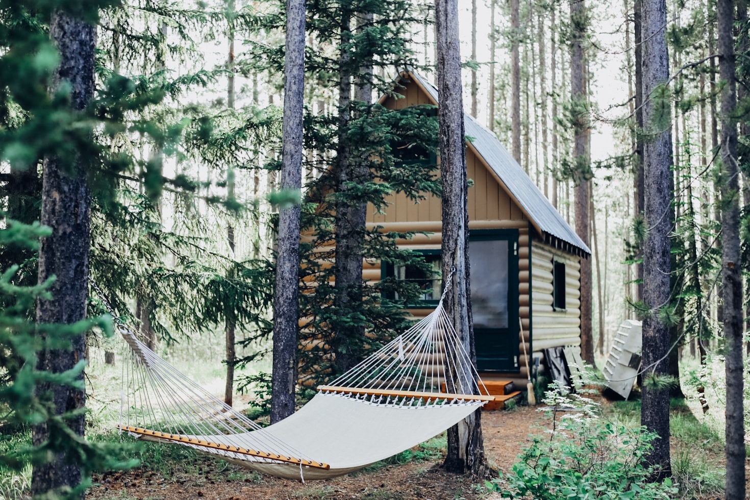
Wooden House, Florida
5.0
Enter a freshly updated and thoughtfully furnished peaceful home surrounded by ancient trees, stone walls, and open meadows.
import {
  Card,
  CardHeader,
  CardBody,
  CardFooter,
  Typography,
  Button,
  Tooltip,
  IconButton,
} from "@material-tailwind/react";

export function BookingCard() {
  return (
    <Card className="w-full max-w-[26rem] shadow-lg">
      <CardHeader floated={false} color="blue-gray">
        <img
          src="https://images.unsplash.com/photo-1499696010180-025ef6e1a8f9?ixlib=rb-4.0.3&ixid=MnwxMjA3fDB8MHxwaG90by1wYWdlfHx8fGVufDB8fHx8&auto=format&fit=crop&w=1470&q=80"
          alt="ui/ux review check"
        />
        <div className="to-bg-black-10 absolute inset-0 h-full w-full bg-gradient-to-tr from-transparent via-transparent to-black/60 " />
        <IconButton
          size="sm"
          color="red"
          variant="text"
          className="!absolute top-4 right-4 rounded-full"
        >
          <svg
            xmlns="http://www.w3.org/2000/svg"
            viewBox="0 0 24 24"
            fill="currentColor"
            className="h-6 w-6"
          >
            <path d="M11.645 20.91l-.007-.003-.022-.012a15.247 15.247 0 01-.383-.218 25.18 25.18 0 01-4.244-3.17C4.688 15.36 2.25 12.174 2.25 8.25 2.25 5.322 4.714 3 7.688 3A5.5 5.5 0 0112 5.052 5.5 5.5 0 0116.313 3c2.973 0 5.437 2.322 5.437 5.25 0 3.925-2.438 7.111-4.739 9.256a25.175 25.175 0 01-4.244 3.17 15.247 15.247 0 01-.383.219l-.022.012-.007.004-.003.001a.752.752 0 01-.704 0l-.003-.001z" />
          </svg>
        </IconButton>
      </CardHeader>
      <CardBody>
        <div className="mb-3 flex items-center justify-between">
          <Typography variant="h5" color="blue-gray" className="font-medium">
            Wooden House, Florida
          </Typography>
          <Typography
            color="blue-gray"
            className="flex items-center gap-1.5 font-normal"
          >
            <svg
              xmlns="http://www.w3.org/2000/svg"
              viewBox="0 0 24 24"
              fill="currentColor"
              className="-mt-0.5 h-5 w-5 text-yellow-700"
            >
              <path
                fillRule="evenodd"
                d="M10.788 3.21c.448-1.077 1.976-1.077 2.424 0l2.082 5.007 5.404.433c1.164.093 1.636 1.545.749 2.305l-4.117 3.527 1.257 5.273c.271 1.136-.964 2.033-1.96 1.425L12 18.354 7.373 21.18c-.996.608-2.231-.29-1.96-1.425l1.257-5.273-4.117-3.527c-.887-.76-.415-2.212.749-2.305l5.404-.433 2.082-5.006z"
                clipRule="evenodd"
              />
            </svg>
            5.0
          </Typography>
        </div>
        <Typography color="gray">
          Enter a freshly updated and thoughtfully furnished peaceful home
          surrounded by ancient trees, stone walls, and open meadows.
        </Typography>
        <div className="group mt-8 inline-flex flex-wrap items-center gap-3">
          <Tooltip content="$129 per night">
            <span className="cursor-pointer rounded-full border border-gray-900/5 bg-gray-900/5 p-3 text-gray-900 transition-colors hover:border-gray-900/10 hover:bg-gray-900/10 hover:!opacity-100 group-hover:opacity-70">
              <svg
                xmlns="http://www.w3.org/2000/svg"
                viewBox="0 0 24 24"
                fill="currentColor"
                className="h-5 w-5"
              >
                <path d="M12 7.5a2.25 2.25 0 100 4.5 2.25 2.25 0 000-4.5z" />
                <path
                  fillRule="evenodd"
                  d="M1.5 4.875C1.5 3.839 2.34 3 3.375 3h17.25c1.035 0 1.875.84 1.875 1.875v9.75c0 1.036-.84 1.875-1.875 1.875H3.375A1.875 1.875 0 011.5 14.625v-9.75zM8.25 9.75a3.75 3.75 0 117.5 0 3.75 3.75 0 01-7.5 0zM18.75 9a.75.75 0 00-.75.75v.008c0 .414.336.75.75.75h.008a.75.75 0 00.75-.75V9.75a.75.75 0 00-.75-.75h-.008zM4.5 9.75A.75.75 0 015.25 9h.008a.75.75 0 01.75.75v.008a.75.75 0 01-.75.75H5.25a.75.75 0 01-.75-.75V9.75z"
                  clipRule="evenodd"
                />
                <path d="M2.25 18a.75.75 0 000 1.5c5.4 0 10.63.722 15.6 2.075 1.19.324 2.4-.558 2.4-1.82V18.75a.75.75 0 00-.75-.75H2.25z" />
              </svg>
            </span>
          </Tooltip>
          <Tooltip content="Free wifi">
            <span className="cursor-pointer rounded-full border border-gray-900/5 bg-gray-900/5 p-3 text-gray-900 transition-colors hover:border-gray-900/10 hover:bg-gray-900/10 hover:!opacity-100 group-hover:opacity-70">
              <svg
                xmlns="http://www.w3.org/2000/svg"
                viewBox="0 0 24 24"
                fill="currentColor"
                className="h-5 w-5"
              >
                <path
                  fillRule="evenodd"
                  d="M1.371 8.143c5.858-5.857 15.356-5.857 21.213 0a.75.75 0 010 1.061l-.53.53a.75.75 0 01-1.06 0c-4.98-4.979-13.053-4.979-18.032 0a.75.75 0 01-1.06 0l-.53-.53a.75.75 0 010-1.06zm3.182 3.182c4.1-4.1 10.749-4.1 14.85 0a.75.75 0 010 1.061l-.53.53a.75.75 0 01-1.062 0 8.25 8.25 0 00-11.667 0 .75.75 0 01-1.06 0l-.53-.53a.75.75 0 010-1.06zm3.204 3.182a6 6 0 018.486 0 .75.75 0 010 1.061l-.53.53a.75.75 0 01-1.061 0 3.75 3.75 0 00-5.304 0 .75.75 0 01-1.06 0l-.53-.53a.75.75 0 010-1.06zm3.182 3.182a1.5 1.5 0 012.122 0 .75.75 0 010 1.061l-.53.53a.75.75 0 01-1.061 0l-.53-.53a.75.75 0 010-1.06z"
                  clipRule="evenodd"
                />
              </svg>
            </span>
          </Tooltip>
          <Tooltip content="2 bedrooms">
            <span className="cursor-pointer rounded-full border border-gray-900/5 bg-gray-900/5 p-3 text-gray-900 transition-colors hover:border-gray-900/10 hover:bg-gray-900/10 hover:!opacity-100 group-hover:opacity-70">
              <svg
                xmlns="http://www.w3.org/2000/svg"
                viewBox="0 0 24 24"
                fill="currentColor"
                className="h-5 w-5"
              >
                <path d="M11.47 3.84a.75.75 0 011.06 0l8.69 8.69a.75.75 0 101.06-1.06l-8.689-8.69a2.25 2.25 0 00-3.182 0l-8.69 8.69a.75.75 0 001.061 1.06l8.69-8.69z" />
                <path d="M12 5.432l8.159 8.159c.03.03.06.058.091.086v6.198c0 1.035-.84 1.875-1.875 1.875H15a.75.75 0 01-.75-.75v-4.5a.75.75 0 00-.75-.75h-3a.75.75 0 00-.75.75V21a.75.75 0 01-.75.75H5.625a1.875 1.875 0 01-1.875-1.875v-6.198a2.29 2.29 0 00.091-.086L12 5.43z" />
              </svg>
            </span>
          </Tooltip>
          <Tooltip content={`65" HDTV`}>
            <span className="cursor-pointer rounded-full border border-gray-900/5 bg-gray-900/5 p-3 text-gray-900 transition-colors hover:border-gray-900/10 hover:bg-gray-900/10 hover:!opacity-100 group-hover:opacity-70">
              <svg
                xmlns="http://www.w3.org/2000/svg"
                viewBox="0 0 24 24"
                fill="currentColor"
                className="h-5 w-5"
              >
                <path d="M19.5 6h-15v9h15V6z" />
                <path
                  fillRule="evenodd"
                  d="M3.375 3C2.339 3 1.5 3.84 1.5 4.875v11.25C1.5 17.16 2.34 18 3.375 18H9.75v1.5H6A.75.75 0 006 21h12a.75.75 0 000-1.5h-3.75V18h6.375c1.035 0 1.875-.84 1.875-1.875V4.875C22.5 3.839 21.66 3 20.625 3H3.375zm0 13.5h17.25a.375.375 0 00.375-.375V4.875a.375.375 0 00-.375-.375H3.375A.375.375 0 003 4.875v11.25c0 .207.168.375.375.375z"
                  clipRule="evenodd"
                />
              </svg>
            </span>
          </Tooltip>
          <Tooltip content="Fire alert">
            <span className="cursor-pointer rounded-full border border-gray-900/5 bg-gray-900/5 p-3 text-gray-900 transition-colors hover:border-gray-900/10 hover:bg-gray-900/10 hover:!opacity-100 group-hover:opacity-70">
              <svg
                xmlns="http://www.w3.org/2000/svg"
                viewBox="0 0 24 24"
                fill="currentColor"
                className="h-5 w-5"
              >
                <path
                  fillRule="evenodd"
                  d="M12.963 2.286a.75.75 0 00-1.071-.136 9.742 9.742 0 00-3.539 6.177A7.547 7.547 0 016.648 6.61a.75.75 0 00-1.152-.082A9 9 0 1015.68 4.534a7.46 7.46 0 01-2.717-2.248zM15.75 14.25a3.75 3.75 0 11-7.313-1.172c.628.465 1.35.81 2.133 1a5.99 5.99 0 011.925-3.545 3.75 3.75 0 013.255 3.717z"
                  clipRule="evenodd"
                />
              </svg>
            </span>
          </Tooltip>
          <Tooltip content="And +20 more">
            <span className="cursor-pointer rounded-full border border-gray-900/5 bg-gray-900/5 p-3 text-gray-900 transition-colors hover:border-gray-900/10 hover:bg-gray-900/10 hover:!opacity-100 group-hover:opacity-70">
              +20
            </span>
          </Tooltip>
        </div>
      </CardBody>
      <CardFooter className="pt-3">
        <Button size="lg" fullWidth={true}>
          Reserve
        </Button>
      </CardFooter>
    </Card>
  );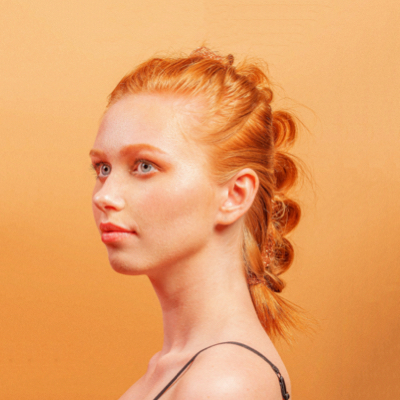
}The testimonial section is a necessary component of any website. Use our card example to create a beautiful testimonial section.
Tania Andrew
Frontend Lead @ Google
"I found solution to all my design needs from Creative Tim. I use them as a freelancer in my hobby projects for fun! And its really affordable, very humble guys !!!"
import {
Card,
CardHeader,
CardBody,
Typography,
Avatar,
} from "@material-tailwind/react";
function StarIcon() {
return (
<svg
xmlns="http://www.w3.org/2000/svg"
viewBox="0 0 24 24"
fill="currentColor"
className="h-5 w-5 text-yellow-700"
>
<path
fillRule="evenodd"
d="M10.788 3.21c.448-1.077 1.976-1.077 2.424 0l2.082 5.007 5.404.433c1.164.093 1.636 1.545.749 2.305l-4.117 3.527 1.257 5.273c.271 1.136-.964 2.033-1.96 1.425L12 18.354 7.373 21.18c-.996.608-2.231-.29-1.96-1.425l1.257-5.273-4.117-3.527c-.887-.76-.415-2.212.749-2.305l5.404-.433 2.082-5.006z"
clipRule="evenodd"
/>
</svg>
);
}
export function TestimonialCard() {
return (
<Card color="transparent" shadow={false} className="w-full max-w-[26rem]">
<CardHeader
color="transparent"
floated={false}
shadow={false}
className="mx-0 flex items-center gap-4 pt-0 pb-8"
>
<Avatar
size="lg"
variant="circular"
src="https://images.unsplash.com/photo-1633332755192-727a05c4013d?ixlib=rb-1.2.1&ixid=MnwxMjA3fDB8MHxwaG90by1wYWdlfHx8fGVufDB8fHx8&auto=format&fit=crop&w=1480&q=80"
alt="tania andrew"
/>
<div className="flex w-full flex-col gap-0.5">
<div className="flex items-center justify-between">
<Typography variant="h5" color="blue-gray">
Tania Andrew
</Typography>
<div className="5 flex items-center gap-0">
<StarIcon />
<StarIcon />
<StarIcon />
<StarIcon />
<StarIcon />
</div>
</div>
<Typography color="blue-gray">Frontend Lead @ Google</Typography>
</div>
</CardHeader>
<CardBody className="mb-6 p-0">
<Typography>
"I found solution to all my design needs from Creative Tim. I use
them as a freelancer in my hobby projects for fun! And its really
affordable, very humble guys !!!"
</Typography>
</CardBody>
</Card>
);
}Here is an example of a simple horizontal card that you can use to showcase the information.
import {
  Card,
  CardHeader,
  CardBody,
  Typography,
  Button,
} from "@material-tailwind/react";

export function HorizontalCard() {
  return (
    <Card className="w-full max-w-[48rem] flex-row">
      <CardHeader
        shadow={false}
        floated={false}
        className="m-0 w-2/5 shrink-0 rounded-r-none"
      >
        <img
          src="https://images.unsplash.com/photo-1522202176988-66273c2fd55f?ixlib=rb-4.0.3&ixid=MnwxMjA3fDB8MHxwaG90by1wYWdlfHx8fGVufDB8fHx8&auto=format&fit=crop&w=1471&q=80"
          alt="card-image"
          className="h-full w-full object-cover"
        />
      </CardHeader>
      <CardBody>
        <Typography variant="h6" color="gray" className="mb-4 uppercase">
          startups
        </Typography>
        <Typography variant="h4" color="blue-gray" className="mb-2">
          Lyft launching cross-platform service this week
        </Typography>
        <Typography color="gray" className="mb-8 font-normal">
          Like so many organizations these days, Autodesk is a company in
          transition. It was until recently a traditional boxed software company
          selling licenses. Yet its own business model disruption is only part
          of the story
        </Typography>
        <a href="#" className="inline-block">
          <Button variant="text" className="flex items-center gap-2">
            Learn More
            <svg
              xmlns="http://www.w3.org/2000/svg"
              fill="none"
              viewBox="0 0 24 24"
              stroke="currentColor"
              strokeWidth={2}
              className="h-4 w-4"
            >
              <path
                strokeLinecap="round"
                strokeLinejoin="round"
                d="M17.25 8.25L21 12m0 0l-3.75 3.75M21 12H3"
              />
            </svg>
          </Button>
        </a>
      </CardBody>
    </Card>
  );
}This ecommerce card is a must for any E-commerce website! Right?

Apple AirPods
$95.00
With plenty of talk and listen time, voice-activated Siri access, and an available wireless charging case.
import {
  Card,
  CardHeader,
  CardBody,
  CardFooter,
  Typography,
  Button,
} from "@material-tailwind/react";

export function EcommerceCard() {
  return (
    <Card className="w-96">
      <CardHeader shadow={false} floated={false} className="h-96">
        <img
          src="https://images.unsplash.com/photo-1629367494173-c78a56567877?ixlib=rb-4.0.3&ixid=MnwxMjA3fDB8MHxwaG90by1wYWdlfHx8fGVufDB8fHx8&auto=format&fit=crop&w=927&q=80"
          alt="card-image"
          className="h-full w-full object-cover"
        />
      </CardHeader>
      <CardBody>
        <div className="mb-2 flex items-center justify-between">
          <Typography color="blue-gray" className="font-medium">
            Apple AirPods
          </Typography>
          <Typography color="blue-gray" className="font-medium">
            $95.00
          </Typography>
        </div>
        <Typography
          variant="small"
          color="gray"
          className="font-normal opacity-75"
        >
          With plenty of talk and listen time, voice-activated Siri access, and
          an available wireless charging case.
        </Typography>
      </CardBody>
      <CardFooter className="pt-0">
        <Button
          ripple={false}
          fullWidth={true}
          className="bg-blue-gray-900/10 text-blue-gray-900 shadow-none hover:scale-105 hover:shadow-none focus:scale-105 focus:shadow-none active:scale-100"
        >
          Add to Cart
        </Button>
      </CardFooter>
    </Card>
  );
}Latest Customers
View all
Tania Andrew
$400

John Micheal
$420
Alexa Liras
$340

Richard Gran
$520

Micheal Levi
$780
import { Card, CardBody, Typography, Avatar } from "@material-tailwind/react";

const customers = [
  {
    name: "Tania Andrew",
    email: "[email protected]",
    price: 400,
    image:
      "https://demos.creative-tim.com/test/corporate-ui-dashboard/assets/img/team-1.jpg",
  },
  {
    name: "John Micheal",
    email: "[email protected]",
    price: 420,
    image:
      "https://demos.creative-tim.com/test/corporate-ui-dashboard/assets/img/team-6.jpg",
  },
  {
    name: "Alexa Liras",
    email: "[email protected]",
    price: 340,
    image:
      "https://demos.creative-tim.com/test/corporate-ui-dashboard/assets/img/team-2.jpg",
  },
  {
    name: "Richard Gran",
    email: "[email protected]",
    price: 520,
    image:
      "https://demos.creative-tim.com/test/corporate-ui-dashboard/assets/img/team-3.jpg",
  },
  {
    name: "Micheal Levi",
    email: "[email protected]",
    price: 780,
    image:
      "https://demos.creative-tim.com/test/corporate-ui-dashboard/assets/img/team-4.jpg",
  },
];

export function CardWithList() {
  return (
    <Card className="w-96">
      <CardBody>
        <div className="mb-4 flex items-center justify-between">
          <Typography variant="h5" color="blue-gray" className="">
            Latest Customers
          </Typography>
          <Typography
            as="a"
            href="#"
            variant="small"
            color="blue"
            className="font-bold"
          >
            View all
          </Typography>
        </div>
        <div className="divide-y divide-gray-200">
          {customers.map(({ name, email, price, image }, index) => (
            <div
              key={index}
              className="flex items-center justify-between pb-3 pt-3 last:pb-0"
            >
              <div className="flex items-center gap-x-3">
                <Avatar size="sm" src={image} alt={name} />
                <div>
                  <Typography color="blue-gray" variant="h6">
                    {name}
                  </Typography>
                  <Typography variant="small" color="gray">
                    {email}
                  </Typography>
                </div>
              </div>
              <Typography color="blue-gray" variant="h6">
                ${price}
              </Typography>
            </div>
          ))}
        </div>
      </CardBody>
    </Card>
  );
}The following props are available for card component. These are the custom props that we've added for the card component and you can use all the other native props as well.
| Attribute | Type | Description | Default |
|---|---|---|---|
variant | Variant | Change card variant | filled |
color | Color | Change card color | white |
shadow | boolean | Add box-shadow for card | true |
className | string | Add custom className for card | '' |
children | node | Add content for card | No default value it's a required prop. |
For TypeScript Only
import type { CardProps } from "@material-tailwind/react";The following props are available for card header component. These are the custom props that we've added for the card header component and you can use all the other native props as well.
| Attribute | Type | Description | Default |
|---|---|---|---|
variant | Variant | Change card header variant | filled |
color | Color | Change card header color | white |
shadow | boolean | Add box-shadow for card header | true |
floated | boolean | Makes card header floated | true |
className | string | Add custom className for card header | '' |
children | node | Add content for card header | No default value it's a required prop. |
For TypeScript Only
import type { CardHeaderProps } from "@material-tailwind/react";The following props are available for card body component. These are the custom props that we've added for the card body component and you can use all the other native props as well.
| Attribute | Type | Description | Default |
|---|---|---|---|
className | string | Add custom className for card body | '' |
children | node | Add content for card body | No default value it's a required prop. |
For TypeScript Only
import type { CardBodyProps } from "@material-tailwind/react";The following props are available for card footer component. These are the custom props that we've added for the card footer component and you can use all the other native props as well.
| Attribute | Type | Description | Default |
|---|---|---|---|
divider | boolean | Add border-top for card footer | false |
className | string | Add custom className for card footer | '' |
children | node | Add content for card footer | No default value it's a required prop. |
For TypeScript Only
import type { CardFooterProps } from "@material-tailwind/react";type variant = "filled" | "gradient";type color =
| "transparent"
| "white"
| "blue-gray"
| "gray"
| "brown"
| "deep-orange"
| "orange"
| "amber"
| "yellow"
| "lime"
| "light-green"
| "green"
| "teal"
| "cyan"
| "light-blue"
| "blue"
| "indigo"
| "deep-purple"
| "purple"
| "pink"
| "red";Learn how to customize the theme and styles for card components, the theme object for card components has three main objects:
A. The defaultProps object for setting up the default value for props of card component.
B. The valid object for customizing the valid values for card component props.
C. The styles object for customizing the theme and styles of card component.
You can customize the theme and styles of card components by adding Tailwind CSS classes as key paired values for objects.
interface CardStylesType {
  defaultProps: {
    variant: string;
    color: string;
    shadow: boolean;
    className: string;
  };
  valid: {
    variants: string[];
    colors: string[];
  };
  styles: {
    base: {
      initial: object;
      shadow: object;
    };
    variants: {
      filled: object;
      gradient: object;
    };
  };
}
For TypeScript Only
import type { CardStylesType } from "@material-tailwind/react";const theme = {
card: {
defaultProps: {
variant: "filled",
color: "white",
shadow: true,
className: "",
},
valid: {
variants: ["filled", "gradient"],
colors: [
"transparent",
"white",
"blue-gray",
"gray",
"brown",
"deep-orange",
"orange",
"amber",
"yellow",
"lime",
"light-green",
"green",
"teal",
"cyan",
"light-blue",
"blue",
"indigo",
"deep-purple",
"purple",
"pink",
"red",
],
},
styles: {
base: {
initial: {
position: "relative",
display: "flex",
flexDirection: "flex-col",
backgroundClip: "bg-clip-border",
borderRadius: "rounded-xl",
},
shadow: {
boxShadow: "shadow-md",
},
},
variants: {
filled: {
transparent: {
backgroud: "bg-transparent",
color: "text-gray-700",
shadow: "shadow-none",
},
white: {
backgroud: "bg-white",
color: "text-gray-700",
},
"blue-gray": {
backgroud: "bg-blue-gray-500",
color: "text-white",
shadow: "shadow-blue-gray-500/40",
},
gray: {
backgroud: "bg-gray-500",
color: "text-white",
shadow: "shadow-gray-500/40",
},
brown: {
backgroud: "bg-brown-500",
color: "text-white",
shadow: "shadow-brown-500/40",
},
"deep-orange": {
backgroud: "bg-deep-orange-500",
color: "text-white",
shadow: "shadow-deep-orange-500/40",
},
orange: {
backgroud: "bg-orange-500",
color: "text-white",
shadow: "shadow-orange-500/40",
},
amber: {
backgroud: "bg-amber-500",
color: "text-gray-700",
shadow: "shadow-amber-500/40",
},
yellow: {
backgroud: "bg-yellow-500",
color: "text-gray-700",
shadow: "shadow-yellow-500/40",
},
lime: {
backgroud: "bg-lime-500",
color: "text-gray-700",
shadow: "shadow-lime-500/40",
},
"light-green": {
backgroud: "bg-light-green-500",
color: "text-white",
shadow: "shadow-light-green-500/40",
},
green: {
backgroud: "bg-green-500",
color: "text-white",
shadow: "shadow-green-500/40",
},
teal: {
backgroud: "bg-teal-500",
color: "text-white",
shadow: "shadow-teal-500/40",
},
cyan: {
backgroud: "bg-cyan-500",
color: "text-white",
shadow: "shadow-cyan-500/40",
},
"light-blue": {
backgroud: "bg-light-blue-500",
color: "text-white",
shadow: "shadow-light-blue-500/40",
},
blue: {
backgroud: "bg-blue-500",
color: "text-white",
shadow: "shadow-blue-500/40",
},
indigo: {
backgroud: "bg-indigo-500",
color: "text-white",
shadow: "shadow-indigo-500/40",
},
"deep-purple": {
backgroud: "bg-deep-purple-500",
color: "text-white",
shadow: "shadow-deep-purple-500/40",
},
purple: {
backgroud: "bg-purple-500",
color: "text-white",
shadow: "shadow-purple-500/40",
},
pink: {
backgroud: "bg-pink-500",
color: "text-white",
shadow: "shadow-pink-500/40",
},
red: {
backgroud: "bg-red-500",
color: "text-white",
shadow: "shadow-red-500/40",
},
},
gradient: {
transparent: {
backgroud: "bg-transparent",
color: "text-gray-700",
shadow: "shadow-none",
},
white: {
backgroud: "bg-white",
color: "text-gray-700",
},
"blue-gray": {
backgroud: "bg-gradient-to-tr from-blue-gray-600 to-blue-gray-400",
color: "text-white",
shadow: "shadow-blue-gray-500/40",
},
gray: {
backgroud: "bg-gradient-to-tr from-gray-600 to-gray-400",
color: "text-white",
shadow: "shadow-gray-500/40",
},
brown: {
backgroud: "bg-gradient-to-tr from-brown-600 to-brown-400",
color: "text-white",
shadow: "shadow-brown-500/40",
},
"deep-orange": {
backgroud: "bg-gradient-to-tr from-deep-orange-600 to-deep-orange-400",
color: "text-white",
shadow: "shadow-deep-orange-500/40",
},
orange: {
backgroud: "bg-gradient-to-tr from-orange-600 to-orange-400",
color: "text-white",
shadow: "shadow-orange-500/40",
},
amber: {
backgroud: "bg-gradient-to-tr from-amber-600 to-amber-400",
color: "text-gray-700",
shadow: "shadow-amber-500/40",
},
yellow: {
backgroud: "bg-gradient-to-tr from-yellow-600 to-yellow-400",
color: "text-gray-700",
shadow: "shadow-yellow-500/40",
},
lime: {
backgroud: "bg-gradient-to-tr from-lime-600 to-lime-400",
color: "text-gray-700",
shadow: "shadow-lime-500/40",
},
"light-green": {
backgroud: "bg-gradient-to-tr from-light-green-600 to-light-green-400",
color: "text-white",
shadow: "shadow-light-green-500/40",
},
green: {
backgroud: "bg-gradient-to-tr from-green-600 to-green-400",
color: "text-white",
shadow: "shadow-green-500/40",
},
teal: {
backgroud: "bg-gradient-to-tr from-teal-600 to-teal-400",
color: "text-white",
shadow: "shadow-teal-500/40",
},
cyan: {
backgroud: "bg-gradient-to-tr from-cyan-600 to-cyan-400",
color: "text-white",
shadow: "shadow-cyan-500/40",
},
"light-blue": {
backgroud: "bg-gradient-to-tr from-light-blue-600 to-light-blue-400",
color: "text-white",
shadow: "shadow-light-blue-500/40",
},
blue: {
backgroud: "bg-gradient-to-tr from-blue-600 to-blue-400",
color: "text-white",
shadow: "shadow-blue-500/40",
},
indigo: {
backgroud: "bg-gradient-to-tr from-indigo-600 to-indigo-400",
color: "text-white",
shadow: "shadow-indigo-500/40",
},
"deep-purple": {
backgroud: "bg-gradient-to-tr from-deep-purple-600 to-deep-purple-400",
color: "text-white",
shadow: "shadow-deep-purple-500/40",
},
purple: {
backgroud: "bg-gradient-to-tr from-purple-600 to-purple-400",
color: "text-white",
shadow: "shadow-purple-500/40",
},
pink: {
backgroud: "bg-gradient-to-tr from-pink-600 to-pink-400",
color: "text-white",
shadow: "shadow-pink-500/40",
},
red: {
backgroud: "bg-gradient-to-tr from-red-600 to-red-400",
color: "text-white",
shadow: "shadow-red-500/40",
},
},
},
},
},
};interface CardHeaderStylesType {
defaultProps: {
variant: string;
color: string;
shadow: boolean;
floated: boolean;
className: string;
};
valid: {
variants: string[];
colors: string[];
};
styles: {
base: {
initial: object;
shadow: object;
floated: object;
};
variants: {
filled: object;
gradient: object;
};
};
}For TypeScript Only
import type { CardHeaderStylesType } from "@material-tailwind/react";const theme = {
cardHeader: {
defaultProps: {
variant: "filled",
color: "white",
shadow: true,
floated: true,
className: "",
},
valid: {
variants: ["filled", "gradient"],
colors: [
"transparent",
"white",
"blue-gray",
"gray",
"brown",
"deep-orange",
"orange",
"amber",
"yellow",
"lime",
"light-green",
"green",
"teal",
"cyan",
"light-blue",
"blue",
"indigo",
"deep-purple",
"purple",
"pink",
"red",
],
},
styles: {
base: {
initial: {
position: "relative",
backgroundClip: "bg-clip-border",
mt: "mt-4",
mx: "mx-4",
borderRadius: "rounded-xl",
overflow: "overflow-hidden",
},
shadow: {
boxShadow: "shadow-lg",
},
floated: {
mt: "-mt-6",
},
},
variants: {
filled: {
transparent: {
backgroud: "bg-transparent",
color: "text-gray-700",
shadow: "shadow-none",
},
white: {
backgroud: "bg-white",
color: "text-gray-700",
},
"blue-gray": {
backgroud: "bg-blue-gray-500",
color: "text-white",
shadow: "shadow-blue-gray-500/40",
},
gray: {
backgroud: "bg-gray-500",
color: "text-white",
shadow: "shadow-gray-500/40",
},
brown: {
backgroud: "bg-brown-500",
color: "text-white",
shadow: "shadow-brown-500/40",
},
"deep-orange": {
backgroud: "bg-deep-orange-500",
color: "text-white",
shadow: "shadow-deep-orange-500/40",
},
orange: {
backgroud: "bg-orange-500",
color: "text-white",
shadow: "shadow-orange-500/40",
},
amber: {
backgroud: "bg-amber-500",
color: "text-gray-700",
shadow: "shadow-amber-500/40",
},
yellow: {
backgroud: "bg-yellow-500",
color: "text-gray-700",
shadow: "shadow-yellow-500/40",
},
lime: {
backgroud: "bg-lime-500",
color: "text-gray-700",
shadow: "shadow-lime-500/40",
},
"light-green": {
backgroud: "bg-light-green-500",
color: "text-white",
shadow: "shadow-light-green-500/40",
},
green: {
backgroud: "bg-green-500",
color: "text-white",
shadow: "shadow-green-500/40",
},
teal: {
backgroud: "bg-teal-500",
color: "text-white",
shadow: "shadow-teal-500/40",
},
cyan: {
backgroud: "bg-cyan-500",
color: "text-white",
shadow: "shadow-cyan-500/40",
},
"light-blue": {
backgroud: "bg-light-blue-500",
color: "text-white",
shadow: "shadow-light-blue-500/40",
},
blue: {
backgroud: "bg-blue-500",
color: "text-white",
shadow: "shadow-blue-500/40",
},
indigo: {
backgroud: "bg-indigo-500",
color: "text-white",
shadow: "shadow-indigo-500/40",
},
"deep-purple": {
backgroud: "bg-deep-purple-500",
color: "text-white",
shadow: "shadow-deep-purple-500/40",
},
purple: {
backgroud: "bg-purple-500",
color: "text-white",
shadow: "shadow-purple-500/40",
},
pink: {
backgroud: "bg-pink-500",
color: "text-white",
shadow: "shadow-pink-500/40",
},
red: {
backgroud: "bg-red-500",
color: "text-white",
shadow: "shadow-red-500/40",
},
},
gradient: {
transparent: {
backgroud: "bg-transparent",
color: "text-gray-700",
shadow: "shadow-none",
},
white: {
backgroud: "bg-white",
color: "text-gray-700",
},
"blue-gray": {
backgroud: "bg-gradient-to-tr from-blue-gray-600 to-blue-gray-400",
color: "text-white",
shadow: "shadow-blue-gray-500/40",
},
gray: {
backgroud: "bg-gradient-to-tr from-gray-600 to-gray-400",
color: "text-white",
shadow: "shadow-gray-500/40",
},
brown: {
backgroud: "bg-gradient-to-tr from-brown-600 to-brown-400",
color: "text-white",
shadow: "shadow-brown-500/40",
},
"deep-orange": {
backgroud: "bg-gradient-to-tr from-deep-orange-600 to-deep-orange-400",
color: "text-white",
shadow: "shadow-deep-orange-500/40",
},
orange: {
backgroud: "bg-gradient-to-tr from-orange-600 to-orange-400",
color: "text-white",
shadow: "shadow-orange-500/40",
},
amber: {
backgroud: "bg-gradient-to-tr from-amber-600 to-amber-400",
color: "text-gray-700",
shadow: "shadow-amber-500/40",
},
yellow: {
backgroud: "bg-gradient-to-tr from-yellow-600 to-yellow-400",
color: "text-gray-700",
shadow: "shadow-yellow-500/40",
},
lime: {
backgroud: "bg-gradient-to-tr from-lime-600 to-lime-400",
color: "text-gray-700",
shadow: "shadow-lime-500/40",
},
"light-green": {
backgroud: "bg-gradient-to-tr from-light-green-600 to-light-green-400",
color: "text-white",
shadow: "shadow-light-green-500/40",
},
green: {
backgroud: "bg-gradient-to-tr from-green-600 to-green-400",
color: "text-white",
shadow: "shadow-green-500/40",
},
teal: {
backgroud: "bg-gradient-to-tr from-teal-600 to-teal-400",
color: "text-white",
shadow: "shadow-teal-500/40",
},
cyan: {
backgroud: "bg-gradient-to-tr from-cyan-600 to-cyan-400",
color: "text-white",
shadow: "shadow-cyan-500/40",
},
"light-blue": {
backgroud: "bg-gradient-to-tr from-light-blue-600 to-light-blue-400",
color: "text-white",
shadow: "shadow-light-blue-500/40",
},
blue: {
backgroud: "bg-gradient-to-tr from-blue-600 to-blue-400",
color: "text-white",
shadow: "shadow-blue-500/40",
},
indigo: {
backgroud: "bg-gradient-to-tr from-indigo-600 to-indigo-400",
color: "text-white",
shadow: "shadow-indigo-500/40",
},
"deep-purple": {
backgroud: "bg-gradient-to-tr from-deep-purple-600 to-deep-purple-400",
color: "text-white",
shadow: "shadow-deep-purple-500/40",
},
purple: {
backgroud: "bg-gradient-to-tr from-purple-600 to-purple-400",
color: "text-white",
shadow: "shadow-purple-500/40",
},
pink: {
backgroud: "bg-gradient-to-tr from-pink-600 to-pink-400",
color: "text-white",
shadow: "shadow-pink-500/40",
},
red: {
backgroud: "bg-gradient-to-tr from-red-600 to-red-400",
color: "text-white",
shadow: "shadow-red-500/40",
},
},
},
},
},
};interface CardBodyStylesType {
defaultProps: {
className: string;
};
styles: {
base: object;
};
}For TypeScript Only
import type { CardBodyStylesType } from "@material-tailwind/react";const theme = {
cardBody: {
defaultProps: {
className: "",
},
styles: {
base: {
p: "p-6",
},
},
},
};interface CardFooterStylesType {
defaultProps: {
className: string;
divider: boolean;
};
styles: {
base: {
initial: object;
divider: object;
};
};
}For TypeScript Only
import type { CardFooterStylesType } from "@material-tailwind/react";const theme = {
cardFooter: {
defaultProps: {
className: "",
},
styles: {
base: {
initial: {
p: "p-6",
},
divider: {
borderWidth: "border-t",
borderColor: "border-blue-gray-50",
},
},
},
},
};Check out more card component examples from Material Tailwind Blocks:
• Cards
• Web 3.0 Cards
• KPI Cards
• Pricing Sections